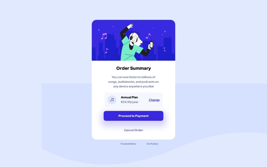
Design comparison
Solution retrospective
Frontend Mentor - Order summary card solution
This is a solution to the Order summary card challenge on Frontend Mentor. Frontend Mentor challenges help you improve your coding skills by building realistic projects.
Table of contents
Overview
The challenge
Users should be able to:
- See hover states for interactive elements
Screenshot

Links
- Solution URL: https://github.com/om-prabhat/order-summary-component-main
- Live Site URL: https://om-prabhat.github.io/order-summary-component-main/
My process
Built with
-
Semantic HTML5 markup
-
CSS custom properties
-
Flexbox
-
CSS Grid
Author
- Website - Om Prabhat
- Frontend Mentor - @yourusername
- Instagram - @om__prabhat
Community feedback
- @DivineUgorjiPosted about 1 year ago
Hello @om__prabhat, congratulations on completing and submitting this challenge. Your implementation looks really nice but I could not help but notice that your background image is not well positioned. Apply the following properties to your code:
background-color: hsl(224, 100%, 94%); background-image: url(image-url); background-position: top; background-repeat: no-repeat;- I would also suggest the use of BEM methodology for your CSS naming conventions.
- I observed the overuse of the pixel unit in your code base. It's always good practice to learn how to use relative units in your projects as it helps with responsiveness. You can check out this blog to learn more about this.
overall, your implementation is very nice, and I hope these few suggestions of mine will help you to improve it better.
All the best 🙏
Marked as helpful1@om-prabhatPosted about 1 year agoThank you for giving feedback. I will surely look it out.@DivineUgorji
1
Please log in to post a comment
Log in with GitHubJoin our Discord community
Join thousands of Frontend Mentor community members taking the challenges, sharing resources, helping each other, and chatting about all things front-end!
Join our Discord
