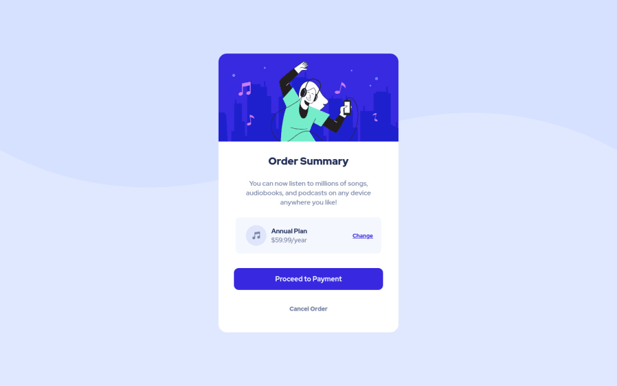
Design comparison
Solution retrospective
Any feedback is highly appreciated!
Community feedback
- @dewslysePosted over 3 years ago
Hello Costi! Nice work on your submission. Really well implemented. Some things to note:
- You could use more semantic sectioning elements within your html. Your could wrap your main content in a
<main>. E.g:
<body>
   <main>
   .
   .
  </main>
</body>
This would help with some accessibility issues.
- You could also wrap your
imgin afigureelement or even aheaderand replace<div class="main>with<main class="main"> - Since the background images are decorative and don't have an alt, you could add
aria-hidden: trueto them for improved accessibility - You may want to update your report to reflect the changes you'll make to the code.
Happy coding
Marked as helpful3 - You could use more semantic sectioning elements within your html. Your could wrap your main content in a
- @FluffyKasPosted over 3 years ago
Hey,
Your solution looks very good to me! The only thing I'd argue with is having inline CSS applied to your illustration. Since you linked a stylesheet to your html, I'd say it's probably not good practice.
Also one small thing: you could try getting into the habit of writing your own README. Frontend Mentor provides even a template for this. The file that you uploaded as your README is actually the information provided for YOU to complete the challenge. ^^
Marked as helpful3@CostiVoicuPosted over 3 years ago@FluffyKas I will consider to write my own README and stop using inline CSS. Thank you!
0
Please log in to post a comment
Log in with GitHubJoin our Discord community
Join thousands of Frontend Mentor community members taking the challenges, sharing resources, helping each other, and chatting about all things front-end!
Join our Discord
