

Design comparison

Solution retrospective
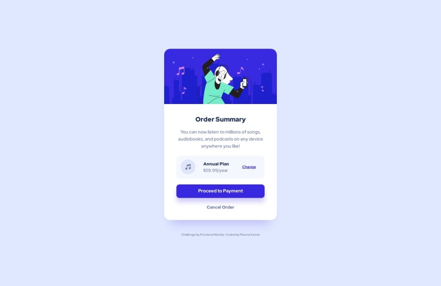
Hi everyone! Please review my solution for this challenge. I would appreciate if you have any feedback or suggestions.
Community feedback
- @hitmorecodePosted over 1 year ago
Congratulations well done. You forgot to add the background image on the body.
/* change min-width to max-width. this will give a better result on small screen */ @media (max-width: 500px) { .order { width: 23rem; }0@poko91Posted over 1 year ago@hitmorecode Thank you for your input. I am confused about the usage of mobile-first approach vs desktop-first approach and always mix-up the two. Will try to research more and practice both. :)
0@hitmorecodePosted over 1 year ago@poko91 actually the mobile first approach is the easy one. When you start with your html markup the majority of the elements are going to be piled on top of each other. If you use three div's, these three div's are going to be one on top of the other.
The same goes for
p,h,sectionand so on. So this means that you mobile layout is automatically done, you just have to use css to make it look good. To switch from mobile to desktop just use media queries.0

Please log in to post a comment
Log in with GitHub
Join our Discord community
Join thousands of Frontend Mentor community members taking the challenges, sharing resources, helping each other, and chatting about all things front-end!
Join our Discord