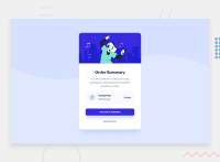
Design comparison
Solution retrospective
Hey,
Here is my first completed challenge on the frontend mentor! I haven't paid for the pro plan yet, so I did it without a figma. Only with the images included in the base folder :)
Do you have any comments to make on this work? And especially on the code? Thank you!
Community feedback
- @guztrilloPosted about 3 years ago
Background image on mobile is missing, but great solution. It's almost identical to the design. Congrats!
Marked as helpful1@xtris-devPosted about 3 years ago@guztrillo Indeed it is badly positioned! Thank you for your comment :)
0 - @amallen1Posted about 3 years ago
Hi Tristan, I think this is an amazing solution to your first challenge. I'm very impressed with how similar it is to the original design especially considering you don't have a pro subscription! I also looked at the code and its very clean and easily readable, great job!
Marked as helpful1 - @dewslysePosted about 3 years ago
Hello Tristan 👋. Congrats on completing your first challenge on frontend mentor. You solution to the order summary component is very well implemented. Good job 👍.
Best of luck with subsequent challenges.
Marked as helpful1@xtris-devPosted about 3 years ago@dewslyse Thank you ! I will start the second tomorrow ;)
1
Please log in to post a comment
Log in with GitHubJoin our Discord community
Join thousands of Frontend Mentor community members taking the challenges, sharing resources, helping each other, and chatting about all things front-end!
Join our Discord

