Submitted over 2 years ago
Responsive manage landing page in html, SCSS & JS
@dazzlerabhi30800
Design comparison
SolutionDesign
Solution retrospective
Please need feedback
Community feedback
- @K4UNGPosted over 2 years ago
Hey! Congrats on finishing this challenge. I have some suggestions for you.
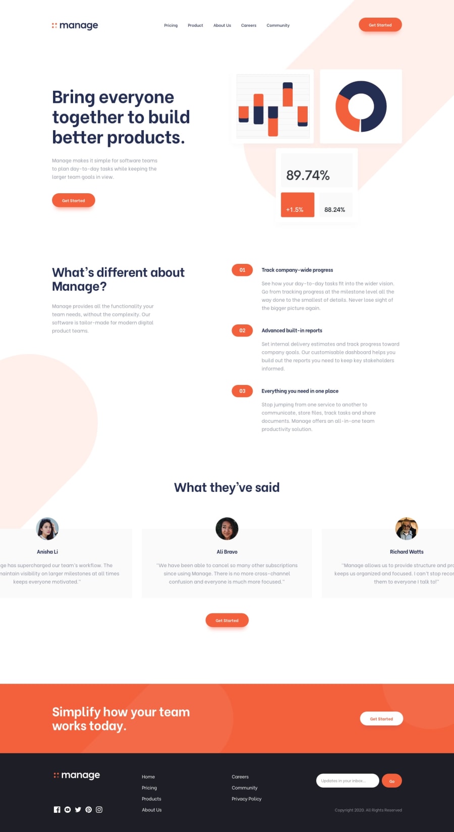
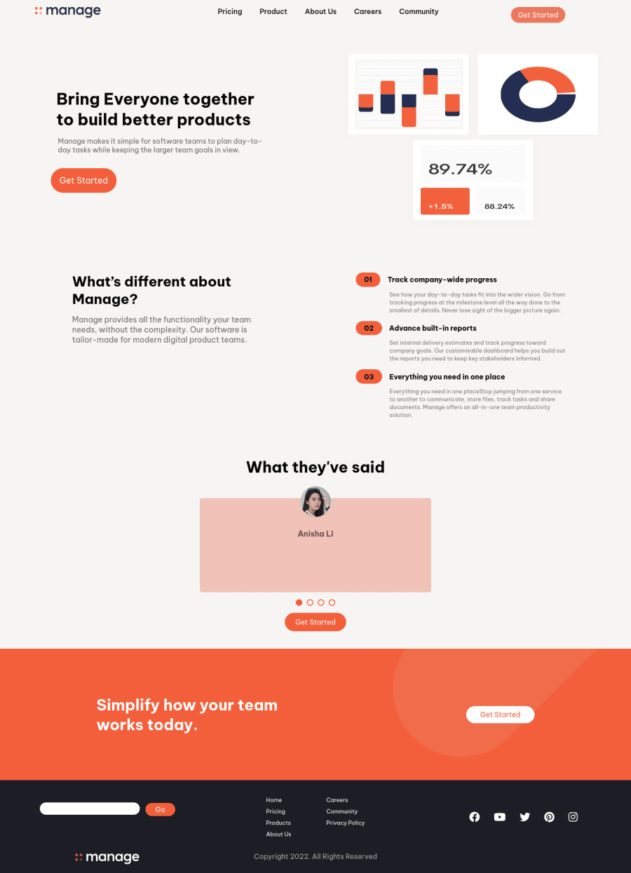
- Your hero image looks stretched because of the specified width. Your could fix this by giving it
height: auto;
or if the image is inside of a container, you could useobject-fit
property. - Having transitions are great but you should make them pretty fast so that it doesn't affect UX design negatively.
- For the slider, instead of only having one tablet and modifying it, you should do it the proper way (at least for this challenge) which is by using a container with
overflow: hidden
that has all the individual tables in it so that you can kinda scroll through them. If you're not sure how to build one, there're lots of great tutorials on Youtube. I really recommend checking them out. - I don't know if it's intentional but I noticed some colors not matching the design image. If it's not, then you should also try fixing them.
Great work and keep going! Happy Coding!
Marked as helpful1@dazzlerabhi30800Posted over 2 years ago@K4UNG Thanks it helps, btw the colors was intentional
1 - Your hero image looks stretched because of the specified width. Your could fix this by giving it
Please log in to post a comment
Log in with GitHubJoin our Discord community
Join thousands of Frontend Mentor community members taking the challenges, sharing resources, helping each other, and chatting about all things front-end!
Join our Discord