Responsive Layout with HTML5, CSS Grid and Flexbox
Design comparison
Solution retrospective
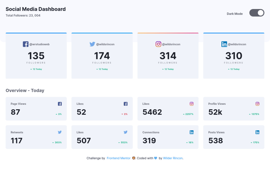
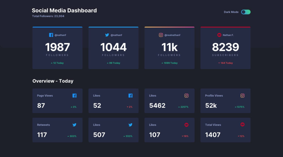
The truth is that the challenge was quite fun, although the dark mode part got a little complicated, but I was able to pull it off and finish it without any problems. But the code can still be improved.
Community feedback
- @JesusAtao96Posted about 4 years ago
Hello Wilder Rincon 👋
Excellent work on this challenge 🎉🎉🎉. Just add
transition: background .5son the body and the header class, now press the dark / light button and the background color change is smoother ✨.Happy coding 😊.
1 - @grace-snowPosted about 4 years ago
Hi,
I really like this one, well done! I particularly like your use of prefers dark mode in your js, that's a great touch.
Your solution is very nearly accessible at the moment, it jusy needs a few small tweaks:
-
Dark mode needs to be inside your checkbox label. That's really important as assistive tech currently has no way of knowing what the checkbox does.
-
Remove the word 'icon' from all alt attributes. It doesn't need to be there and will make some parts read poorly (like "image, up icon, twenty")
-
Don't use article tags unless it's really standalone content, ie a heading and subconent at least.
I hope these accessibility tips are helpful (if they are, upvote). I'll definitely be favouriting this solution!
1 -
- @wildsrinconPosted about 4 years ago
Thank you so much for yours feedbacks, I have already made some changes suggested by you, thank you for your comments.
0
Please log in to post a comment
Log in with GitHubJoin our Discord community
Join thousands of Frontend Mentor community members taking the challenges, sharing resources, helping each other, and chatting about all things front-end!
Join our Discord
