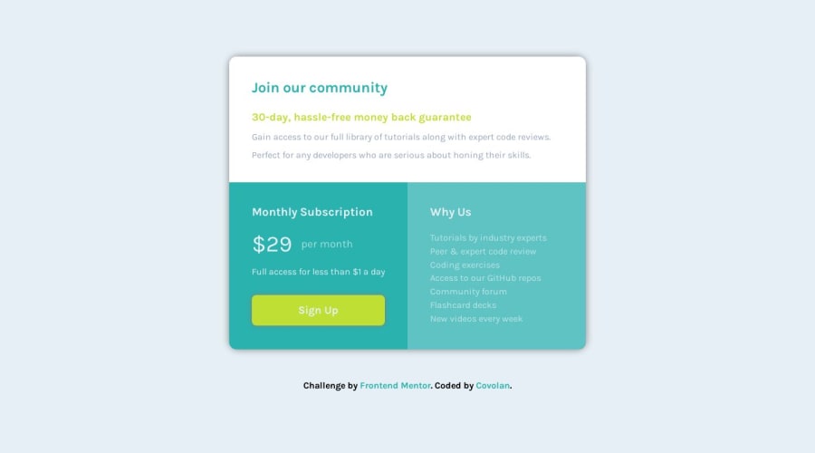
Responsive layout for the single price grid challenge using SASS


Design comparison

Solution retrospective
Hi Frontend Mentor community! 👋
This is my take on the single price grid challenge!
Overall a very simple webpage to develop and learn the grid layout on CSS. My solution ended up being quite robust 😅. Any tips on redundancy code or how to improve into styling this kind of pages?
One thing that I was unsure about was the height of the page, on the body I used 100svh and had to change to 100% into the media query to properly fit the screen, any tips regarding why that happened?
body {
  height: 100svh;
}

@media screen and (max-width: 620px) {
  body {
    height: 100%;
  }
}
Thanks in advance for any tips and help with the code! 😄
Community feedback
- @hitmorecodePosted about 1 year ago
Nice well done, looks good.
When it comes to height just go with
min-height: 100vh;it can never go wrong 😎. On the body changeheight: 100svh;tomin-height: 100vh;and you can remove the one inside the media query.Marked as helpful2@covolanPosted about 1 year ago@hitmorecode Thanks for the tip!!😁 I will change right the way!
0

Please log in to post a comment
Log in with GitHub
Join our Discord community
Join thousands of Frontend Mentor community members taking the challenges, sharing resources, helping each other, and chatting about all things front-end!
Join our Discord