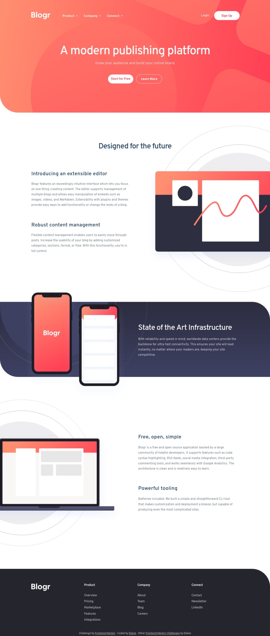
Responsive landing page with mobile nav and dropdown nav

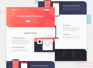
Design comparison

Solution retrospective
This was a very straightforward landing page, but this took me a lot of time; it might even be the one project I've spent the most time on so far. The positioning of the elements was challenging as usual, but the most difficult and time-consuming task was trying to understand some of the design choices (such as having two very similar sans-serif fonts, and then where they get used in the text was not as apparent as I thought). Anyway, at least I now learned how I can position elements off the page and have it be responsive! I'm just glad it's over and we can all move on with life 😅
Very minimal animation here (or much of anything really) since I just wanted to focus on the important parts of the CSS, which is messier than usual as I wanted to try to structure it the way similar to what Kevin Powell did in his latest tutorial series. I also wanted to bring in some CUBE CSS since Kevin did that also. In short, a lot of experimenting, not too much organizing and therefore will clean up and refactor later.
As always, please feel free to let me know whether something isn't working the way it should. Thank you everyone!
Please log in to post a comment
Log in with GitHubCommunity feedback
- @crsimpson5
Hey Elaine, great job on your solution! You handled the element positioning really well, and it looks great on any screen size. A few tiny things you could improve:
- The dropdown arrow icons show a pointer, but they can't open the dropdown.
- The first cta button is getting stretched since the second one has a border, so the text isn't quite vertically aligned. It's only 2px off, but if it was a bigger border it would be more obvious. To fix this, you could use a custom property on the cta class for the border color and have it default to the background color.
- The attribution at the bottom could use a bit of line height on mobile.
Your solution is nearly perfect, so I could only find some tiny improvements 😛. Well done!
Marked as helpful - @Aik-202
Hi Elaine, Nice work! You did justice to this!. The responsiveness is on point, but I have some suggestions: 1.) For the desktop site view on mobile... The text "Designed For The Future" overflowed to the next line.. try adjusting it so it takes up a single line. 2.) Then the sub headings "Introducing an exrensible editor" and "Robust...", Try increasing their font size and reducing that of their respective paragraphs... 3.) For Mobile normal screen the images seem too big, I advice you reduce them a little. And the drop down menu for Products, Company, Connect... Seems to have an issue displaying the contents appropriately... Try checking the JavaScript functions that activates that feature, I think that might be where the problem is coming from.
Marked as helpful - @Senkuu-Midoriya
Hey Elaine, amazing website that you have done here, the design and you webpage are pixel perfect, it is so hard to get it that way, and it surely must have taken a lot of effort, but it shows in the webpage, which looks amazing. If I may, the start for free button, when it is hovered everything works fine, but when you take the cursor out of the button the outline from the hover affect still stays. Also the image in the second part of the webpage is not positioned a bit askew, in the design some of the picture is cut of, I would suggest that you apply an overflow hidden on the body, and add a padding or margin the picture or the text next to it depending on how your code is formatted.
If you don't mind I would love for to answer these questions of mine relating to the webpage: 1. How were you able to but the background image on top of the hero. 2. How were you able to apply the JS for the dropdown menu. Any answers to these questions is invaluable to a newbie like me, to gain knowledge from an experience web dev like you. :)
Thank you for sharing this webpage with use and allowing us to learn thorough it, aDev
Marked as helpful - @Chaffexd
Hey Elaine! Another great project. It's clean, responsive and works well. One thing I noticed when I checked mobile view is that the dropdown doesn't show the li items as expected. You can check this here: https://snipboard.io/OBfs2U.jpg
That's the only thing I could notice but I noticed you said you'd refactor later on, good work!
Marked as helpful


Join our Discord community
Join thousands of Frontend Mentor community members taking the challenges, sharing resources, helping each other, and chatting about all things front-end!
Join our Discord