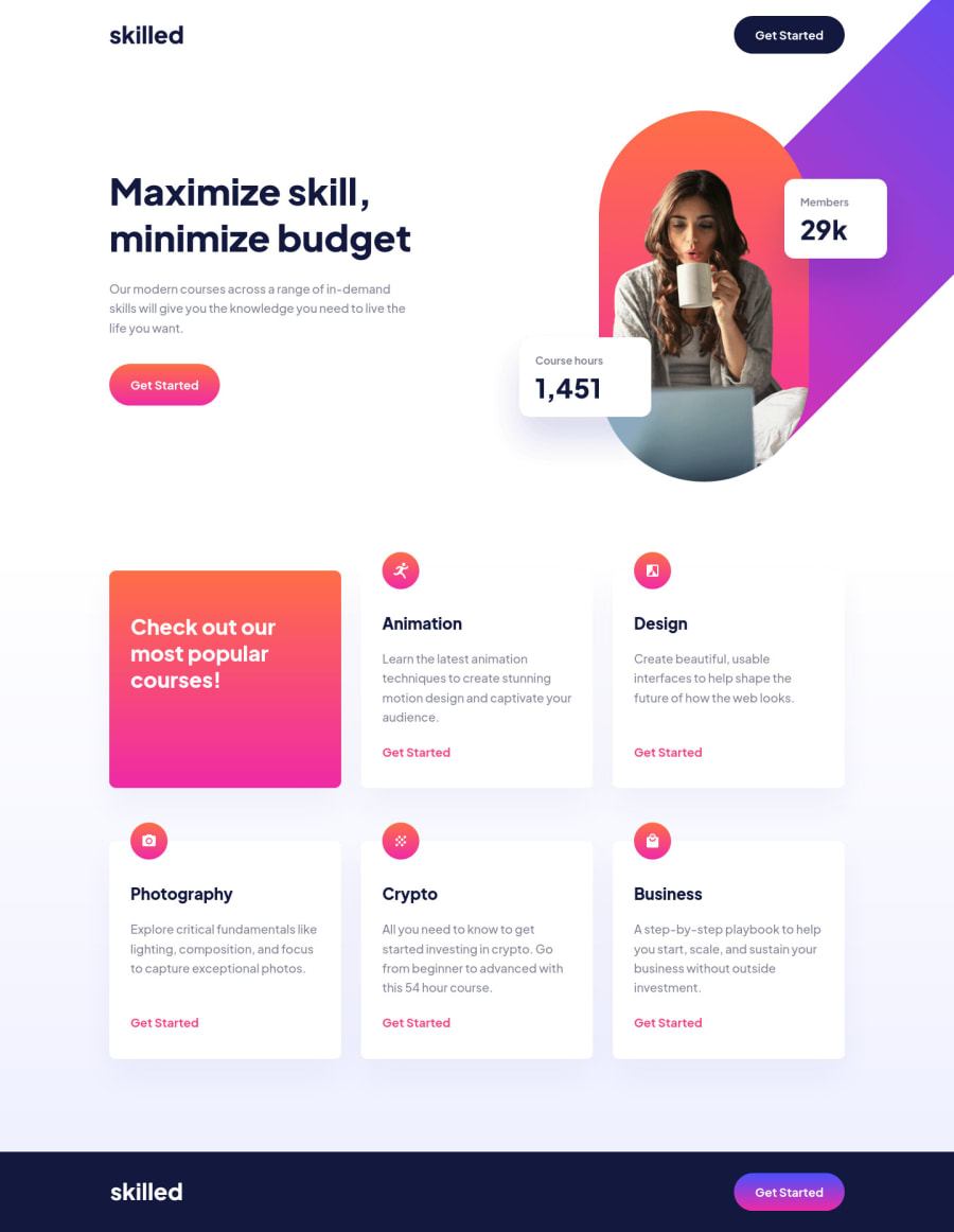
Design comparison
Solution retrospective
Hey all! 👋
I've got some questions about this challenge that I would be glad if you could answear 😀
Do you know a better way to position the hero graphic without using absolute positioning?
How would you go on to make the hero graphic/image accessible as there is valueable information in it?
Any feedback is appreciated!
Community feedback
- Account deleted
you can use flex to align hero__content and graphic and then use transform translate in desktop media instead of using position
Marked as helpful0@abedfetratPosted over 2 years ago@Abdulrahman-M-Darwish I tried using grid but there was a big empty space at the bottom of the hero because of where the graphic was sitting before doing transform translate. Totally forgottt about flex actually, I'll try it with that. Thanks!
1
Please log in to post a comment
Log in with GitHubJoin our Discord community
Join thousands of Frontend Mentor community members taking the challenges, sharing resources, helping each other, and chatting about all things front-end!
Join our Discord
