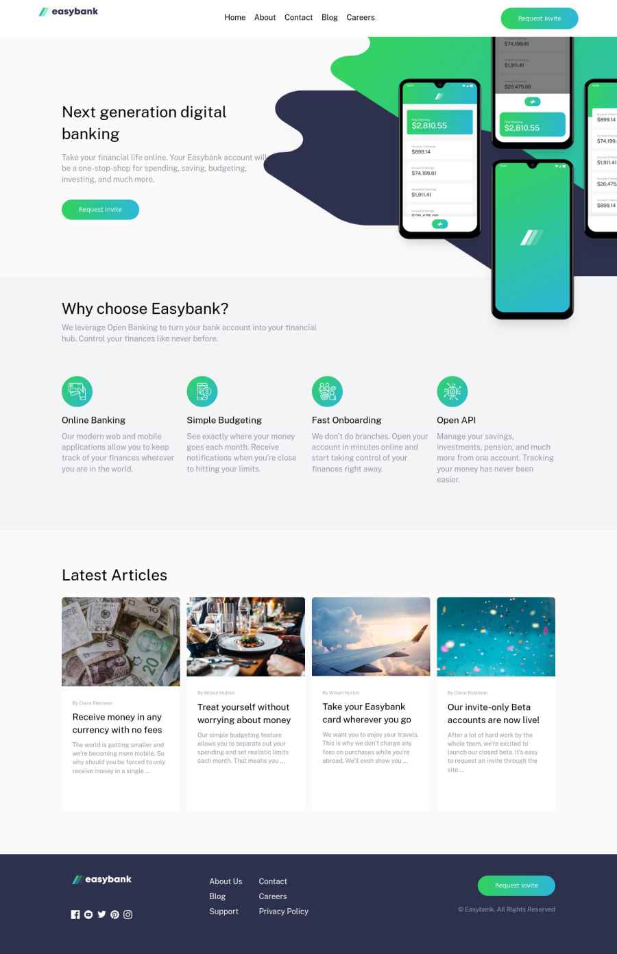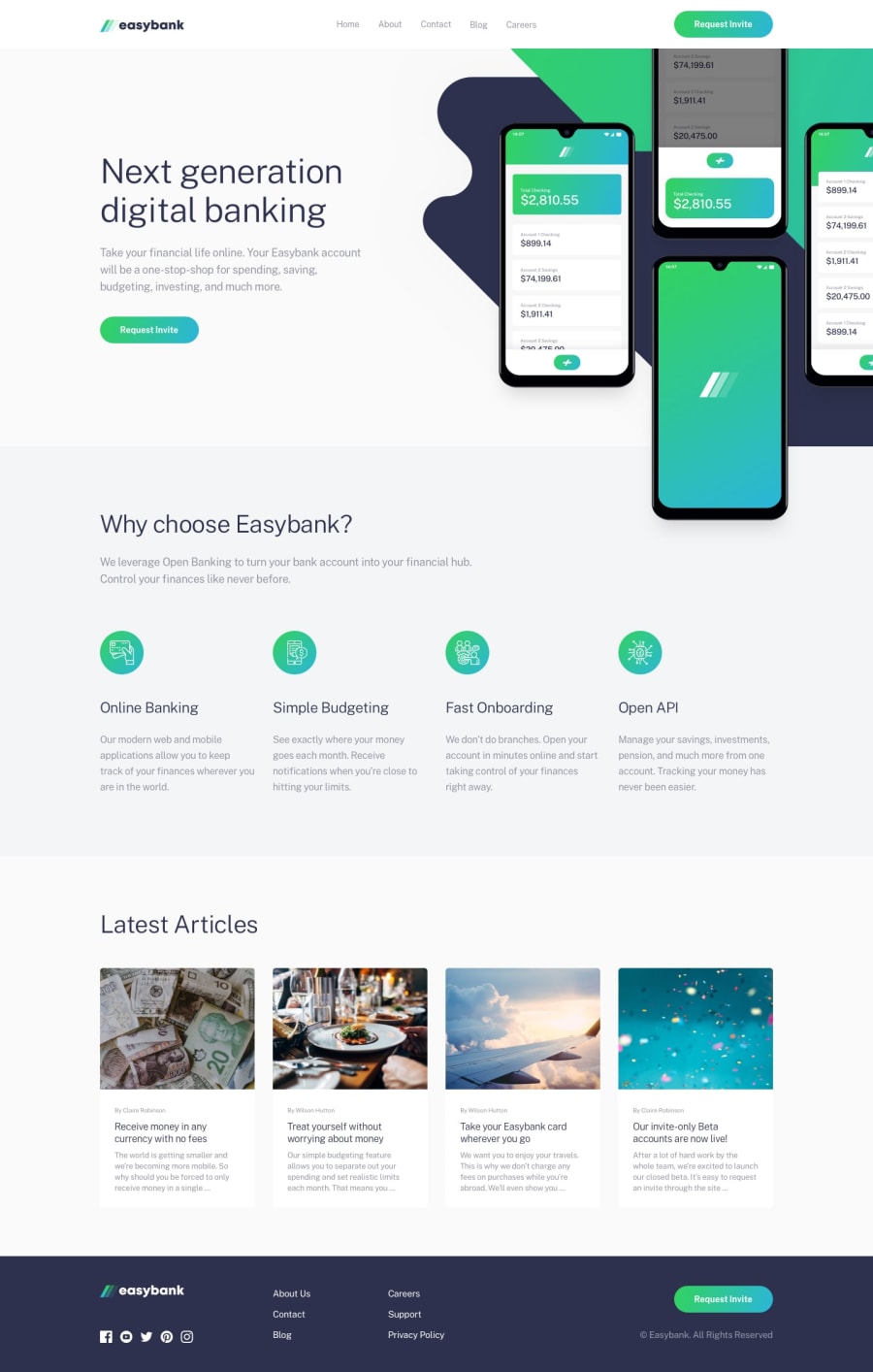
Responsive landing page using HTML5, CSS3, JavaScript, Flexbox
Design comparison
Solution retrospective
My fellows, I appreciate your review and feedback on this project. I am still learning and will like to know what I am not doing well so I can improve. Reference to helpful resources is also appreciated. Thanks in anticipation.
Community feedback
- @emestabilloPosted almost 4 years ago
Hi @obioraigboanusi, congrats on this challenge! Here are some thoughts:
-
I think if you moved
mainright before theherodiv, you might not need thesr-onlyheader on thewhysection, since it is an exact copy of the text in the hero. -
On tablet view, the paragraph under the
whysection is left-aligned. -
Also on tablet, the dark overlay for the menu is not covering the entire width of the viewport. Width is at 100%, which means it is 100% of the parent
nav-wrapper, which also means if the parent has margins (it's set to auto), the overlay will follow this setting as well. -
The articles are missing their anchor tags that link to the full story
-
Might be better to keep the outline on the buttons so users can get cues when they're tabbing through the site
Hope this helps :-)
1@Obiora-PrimeTechPosted almost 4 years ago@emestabillo Thanks for your detailed review. I will effect the adjustments. Thanks a lot.
0 -
Please log in to post a comment
Log in with GitHubJoin our Discord community
Join thousands of Frontend Mentor community members taking the challenges, sharing resources, helping each other, and chatting about all things front-end!
Join our Discord
