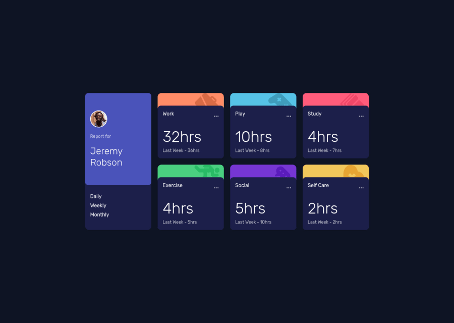
Design comparison
SolutionDesign
Solution retrospective
I have yet to work on the active state of the landing page using JS. This is just HTML/CSS.
Community feedback
- @MaryEhbPosted over 3 years ago
Well done this design can be a little tricky for some people and I liked how you dealt with the backgrounds of the boxs I just have some small modifications you may have not seen:
- The frequency div should align its children in a row at small screens
- the three dots icons color should change to white when hovered on
- and also don't forget to make the frequency selected item be white and the other choices grey when you add js That's it hope this help and I will be waiting for the active state of the site
Marked as helpful1@halamhPosted over 3 years agoHi @MaryEhb ! Thank you for your suggestions, I'll implement them asap!
0
Please log in to post a comment
Log in with GitHubJoin our Discord community
Join thousands of Frontend Mentor community members taking the challenges, sharing resources, helping each other, and chatting about all things front-end!
Join our Discord
