Responsive landing page using Grid and Flexbox
Design comparison
Solution retrospective
Tear it apart!! No, I'm only kidding. Please be gentle. But I have much to learn so the more constructive feedback I receive the better. Always at the top of my mind is accessibility, organization/structure, best practices and so on. Thank you in advance for the help and support. Cheers!
Community feedback
- @vanzasetiaPosted over 2 years ago
Hello there, Jason Greenwald! 👋
Nice work on this challenge! 👍
The
aria-label
on the social media links might not be appropriate. They are actually the social media links of the company. So, I would recommend making thearia-label
as simple as possible. For example, for the Facebook link,aria-label="Facebook"
.Some more recommendations from me.
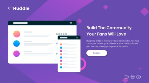
- For the logo image and the hero image, I would recommend making them the actual image elements on the HTML instead of background images. I am sure that it will make it easier to style. Currently, you have to specify the size in order for the images to appear.
- On
900px
width, the text content of thep
element (page__pitch
) is very wide. So, I would recommend setting amax-width
to prevent this from happening. - Write your code with a consistent style (e.g. the indentation, quotes, whitespace, etc). If you write your code that way, it will make it easier to read for everyone (including your future self). But, this can be done automatically by your code editor or an extension.
That's it! Hope this helps. 😊
Marked as helpful1@jaycgreenwaldPosted over 2 years ago@vanzasetia Thank you so much for the feedback!
0 - @jaycgreenwaldPosted over 2 years ago
I read the accessibility report and added aria labels to the social media links. This was my first time using aria so feedback about that is appreciated.
0
Please log in to post a comment
Log in with GitHubJoin our Discord community
Join thousands of Frontend Mentor community members taking the challenges, sharing resources, helping each other, and chatting about all things front-end!
Join our Discord