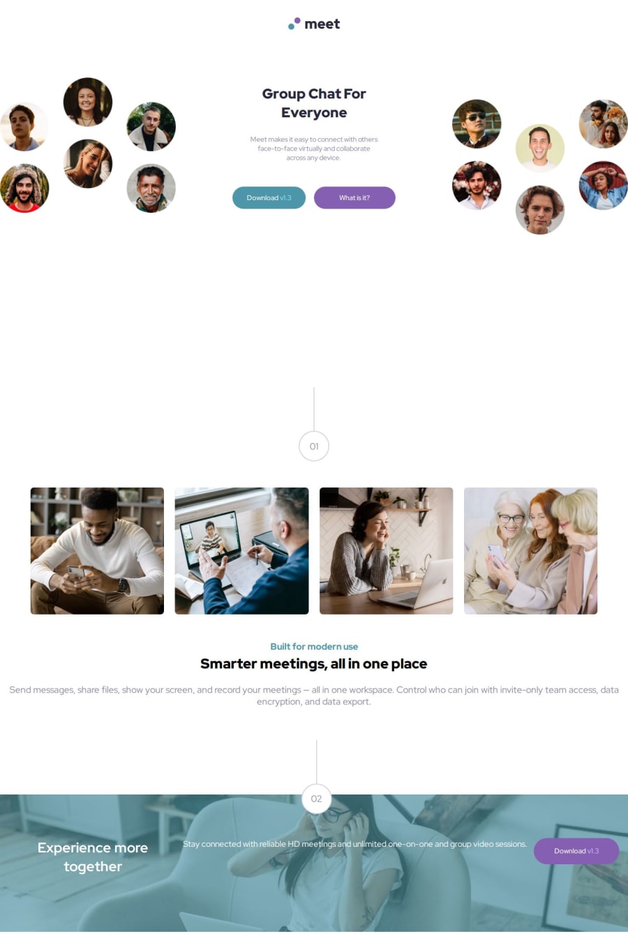
Responsive landing page using css grid, flexbox and media queries.


Design comparison

Community feedback
- P@dev-ethanjohnPosted 20 days ago
Hi, great job for completing this challenge. I have some issues though while previewing your page. It seems there is a lot going on your layout and positioning. For some screens, the spacing between your hero section and the 1st feature is quite large.
Within your CSS , you may ignore media query for extra small devices especially when you style mobile first. Your default styling is your mobile layout so no need of media query for that. Use
eminstead of pixel on your breakpoints. Also, you can explore clamp(), max-width, or width: min() to make your text and containers responsive on different screen sizes. Further, I noticed you put a lot of fixed values like vh / vw and fixed pixel to a lot of your components. Instead of those fixed values, try to leverage padding or grid/flexbox to size and align your contents.Apologize if I can't pinpoint exactly all specific fixes you can do, but my recommendations I believe could help you step back a little and play around with these concepts. Good luck!
Marked as helpful0

Please log in to post a comment
Log in with GitHub
Join our Discord community
Join thousands of Frontend Mentor community members taking the challenges, sharing resources, helping each other, and chatting about all things front-end!
Join our Discord