Submitted over 3 years agoA solution to the Manage landing page challenge
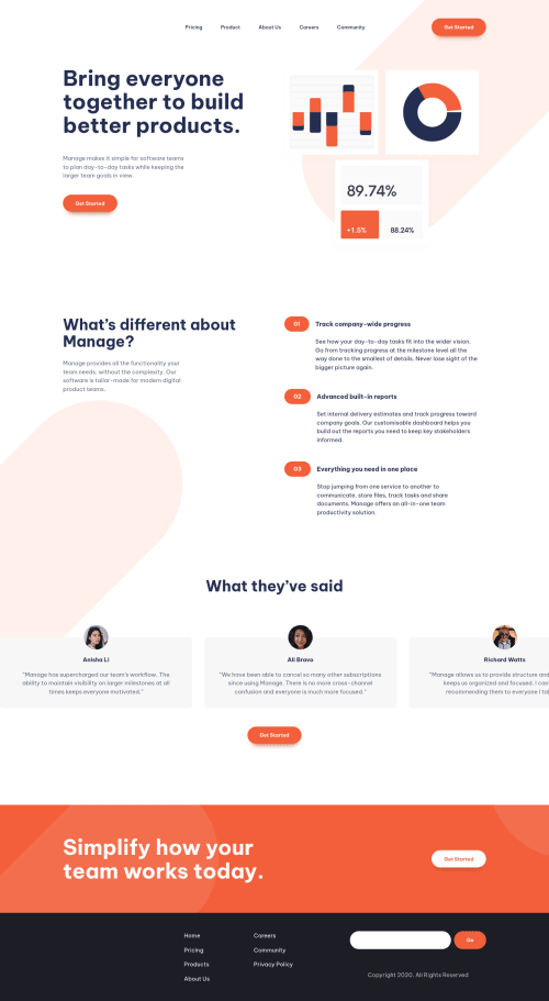
Responsive landing page using CSS grid and Flexbox and JavaScript
P
@ShanePinderDev

Solution retrospective
I built this following Kevin Powell's YouTube series. It was an interesting and humbling learning experience. The main lesson was how much more I still need to learn.
Code
Loading...
Please log in to post a comment
Log in with GitHubCommunity feedback
No feedback yet. Be the first to give feedback on Shane Pinder's solution.
Join our Discord community
Join thousands of Frontend Mentor community members taking the challenges, sharing resources, helping each other, and chatting about all things front-end!
Join our Discord