Submitted almost 3 years ago
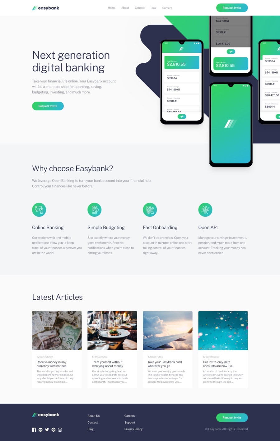
Responsive landing page using CSS Grid and Flexbox
@abedfetrat
Design comparison
SolutionDesign
Solution retrospective
Hey all! This is my first FEM project. Took me some time to complete because I tried to match it to the design as best as I could. My questions are:
- When using BEM, to avoid long class names would it be OK in this example below to write more like
feature__headinginstead offeatures__feature-heading:
<div class="features__features-list">
                    <div class="features__feature">
                        <img class="features__feature-icon" src="./images/icon-online.svg" alt="">
                        <h3 class="features__feature-heading">Online Banking</h3>
                        <p class="features__feature-description">
                            Our modern web and mobile applications allow you to keep track of your finances wherever you are in the world.
                        </p>
                    </div>
</div>
- Any suggestions on how I can make more/better use of CSS custom properties?
- What do you think of the overall code quality?
Thank you for checking my solution!
Community feedback
- @RioCantrePosted almost 3 years ago
Hello there! Awesome work with this one. Looking at your solution, I would suggest the following for you...
- Import the
attributionstyle in the CSS file and removestyletag - Wrap the
navbarwith adivinstead ofheaderwhich is already use to wrap the whole content ofjs-primary-header - Include description with the
altinimgtag - I'm not familiar in BEM, but if you want to make it simple, use the simplest form or refer it with this BEM Naming
Overall, you did great, the CSS file is well organized. Hope this helps and Keep up the good work!
Marked as helpful0@abedfetratPosted almost 3 years ago@RioCantre Thank you for your feedback! I will adjust accordingly
1 - Import the
Please log in to post a comment
Log in with GitHubJoin our Discord community
Join thousands of Frontend Mentor community members taking the challenges, sharing resources, helping each other, and chatting about all things front-end!
Join our Discord
