

Design comparison

Community feedback
- @st0272Posted 21 days ago
Your code is generally well-structured, but several issues and areas for improvement in terms of semantics, accessibility, and organization. Below is my opinion for improvement.
Use of
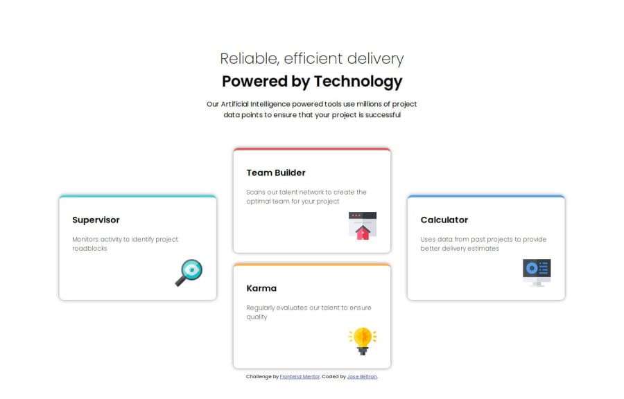
<p>for titlesThe
<p>tag is used for headings like "Reliable, efficient delivery" and "Powered by Technology", which should be in<h1>and<h2>respectively for better semantics.Missing
altattributes in imagesThe <img> tags have an empty
alt="", which is not good for accessibility.Improper nesting of divs
The
content-cards-twodiv is nested inside the.content-cardsbut is structured inconsistently. It appears that all.cardelements should be direct children of.content-cardsfor better alignment and flexibility. Using grid to style this four-card layout is efficient.I hope my advice will be helpful for your coding. Keep up the good work!
0

Please log in to post a comment
Log in with GitHubJoin our Discord community
Join thousands of Frontend Mentor community members taking the challenges, sharing resources, helping each other, and chatting about all things front-end!
Join our Discord