Design comparison
SolutionDesign
Solution retrospective
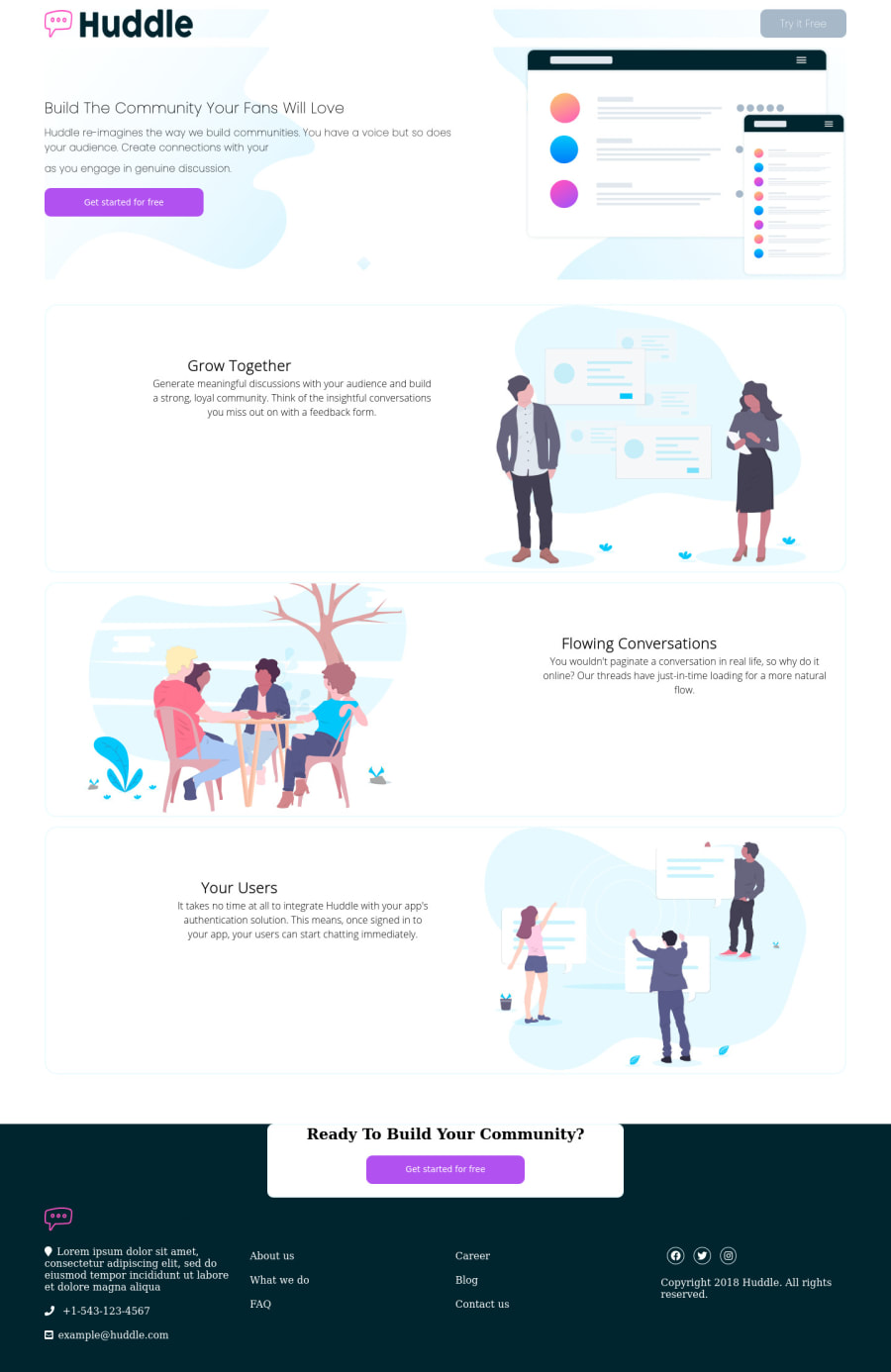
Hey! So i couldn't mix the footer with the button section. I tried but well.
Community feedback
- @dusanlukic404Posted over 3 years ago
Hi Guillermo, I have some suggestions for you:
- Firstly, see the design and look how different it is from your solution
- Use proper font-families. You have one for body and call-to-actions and second one for headings
- Change the title of the document
- Use position relative on your card with button (that's card before footer)
- You should also set padding on hero page and make it 100vh
Marked as helpful0 - @arkharman12Posted over 3 years ago
Try looking into position absolute and relative. That can fix your problem.
0
Please log in to post a comment
Log in with GitHubJoin our Discord community
Join thousands of Frontend Mentor community members taking the challenges, sharing resources, helping each other, and chatting about all things front-end!
Join our Discord
