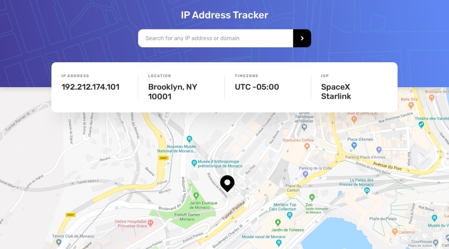
Design comparison
SolutionDesign
Solution retrospective
This is the updated version of my first attempt to solving this challenge.
What I improved:
- New markup structure
- Followed a naming convention (i. e. BEM)
- Simplified my CSS by reducing the overuse of specific selectors.
- Use relative over px
What I want to improve:
I think I need to improve my JavaScript code.
And yeah any feedback is appreciated :)
Community feedback
- @Dharmik48Posted about 3 years ago
Hey👋,
Great Job on completing the solution! It is really good, though some things you can improve are:
- The
font-sizeof the headings(ip address, location, timezone and isp) is very small so, it's not readable, increase it a bit. - Also one more thing is that the
fontof the input isn't the same in design but its no big deal.
Keep it up👍.
Marked as helpful1@ahmed520bPosted about 3 years ago@Dharmik48 Thanks for taking the time to write this helpful feedback! ✨
Away from this challenge.. I want to know if I’m submitting my solutions in an incorrect way, maybe that’s why I don’t find my solutions in my profile!
0 - The
Please log in to post a comment
Log in with GitHubJoin our Discord community
Join thousands of Frontend Mentor community members taking the challenges, sharing resources, helping each other, and chatting about all things front-end!
Join our Discord
