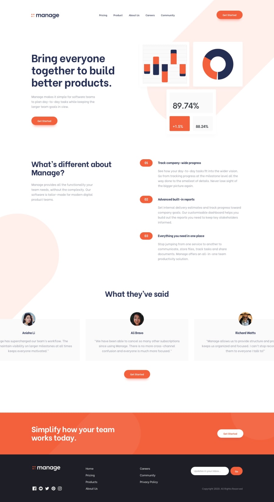
Responsive implementation with some animations and keen-slider!
Design comparison
Solution retrospective
I implemented keen-slider for the first time and it seems smooth and clean. I also made for the first time an :active ripple-like button animation. It was a bit challenging making this responsive for all devices but it was a joy!
Community feedback
- @Saif-Mohammed1Posted about 2 years ago
Hello Nick C. you did great work with this code, I checked your website and I found an issue with the navigation bar when the screen width is between 600px and 700px check it best regards.
1@niemalPosted about 2 years ago@Saif-Mohammed1 Thanks for making note of that, I reduced the
gapof the navigation bar, seems like it's the best I can do. I could make the hamburger menu a thing on tablet too but I believe it's not necessary, as most tablets' width is 1080, the width 600~700 is a pretty far edged case.Again, I appreciate your feedback! Cheers.
0
Please log in to post a comment
Log in with GitHubJoin our Discord community
Join thousands of Frontend Mentor community members taking the challenges, sharing resources, helping each other, and chatting about all things front-end!
Join our Discord
