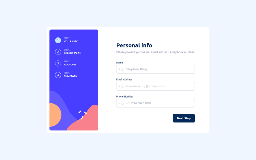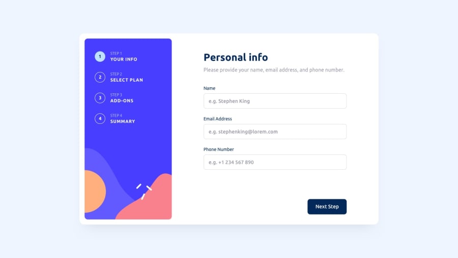
Responsive implementation using framer-motion, confetti at the end!
Design comparison
Solution retrospective
I did my best to polish my skills and closed it up with a confetti animation (!). By implementing smooth animations my overall knowledge has expanded, and this was clearly a bothersome advanced task to handle. Feel free to point out any bugs or improvements!
Community feedback
- @grace-snowPosted about 2 years ago
Hi
As a keyboard user this is unusable for me as you have an event listener on a div. The whole form is missing on this first step
And if I was using my screenreader today I can see this wouldn't work at all, as there is lots of text in spans rather than a proper progress stepper component that tells me the current step. Here's an example of the kind of progress stepper I mean
The inputs on this are unlabelled.
And the error messages should have elements present at all times with a unique ID on them and aria-live attribute. Then each input should have aria-describedby pointing to the ID of their error message element. This is how you should programmatically link errors with their inputs
Always test with a keyboard 😉
Marked as helpful1@niemalPosted about 2 years ago@grace-snow Thank you for the feedback!
Yes, I was and always am in a rush, I didn't spend too much time on focusing on the accessibility which is indeed of great essence. I will proceed:
- Adding labels for the inputs.
- Ensure error messages have elements present at all times with a unique ID and aria-live attribute. Then each input should have aria-describedby pointing to the error message element.
- Ensure a keyboard-only function is possible by tabbing through the input elements and the buttons.
- Ensure a screen-reader experience is as it should be.
Will start working on it soon! Again, appreciate the feedback!
0@grace-snowPosted about 2 years ago@niemal yeah it's all html fundamentals, nothing special needed really. Have fun!
1@niemalPosted about 2 years ago@grace-snow I am not sure if there's sarcasm intended in your statement but I will take it as if there's none! It is something special needed, really. I also believe in a web accessible by everyone, especially those who have health issues and special needs!
However, sloppy as I am, I oversaw this and didn't make it a priority. Indeed I will revisit the fundamentals and implement them widely to all projects of mine as soon as I find the time to do so as I rise to the career of a professional web developer.
I wish you fun as well on your journey.
0@grace-snowPosted about 2 years ago@niemal definitely no sarcasm intended!
I mean it's all foundational stuff that we have to embed again and again and keep reminding ourselves about so we don't exclude people.
And luckily most things like this are fairly straightforward to fix (although js frameworks make stuff that's built into HTML super difficult sometimes - like good focus management. That can make my brain hurt!)
1@niemalPosted about 2 years ago@grace-snow There we go, I implemented the following points:
- Adding labels for the inputs.
- Ensure error messages have elements present at all times with a unique ID and aria-live attribute. Then each input should have aria-describedby pointing to the error message element.
- Ensure a keyboard-only function is possible by tabbing through the input elements and the buttons.
I have to test the following now:
- Ensure a screen-reader experience is as it should be.
Through-out I learned how to leverage
React.Children.toArray()andReact.cloneElement()to pass down props appropriately to children components! Furthermore I now understand fully thetabindexbehaviour, which at first was tricky but now seems understandable.Again, thanks for the feedback, I will now develop with these principles in mind.
0@grace-snowPosted about 2 years ago@niemal no you really MUST never use divs with tabindex! This is a form submit button. Use the correct interactive elements. It's inaccessible otherwise, tabindex is not enough
0 - @adriano-wbPosted about 2 years ago
Very good my friend, great animation, yours was one of the best I've seen. I don't think there's anything special you need to improve on, you're talented.
1@niemalPosted about 2 years ago@adriano-wb Thank you for your kind words, but that's far from true! There's always something to learn, even from the least challenging things!
1
Please log in to post a comment
Log in with GitHubJoin our Discord community
Join thousands of Frontend Mentor community members taking the challenges, sharing resources, helping each other, and chatting about all things front-end!
Join our Discord
