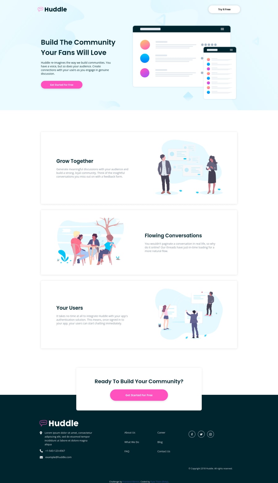
Design comparison
Solution retrospective
I tried my best on this challenge but I feel like I could've shorten some lines of codes so a feedback on my solution would be much appreciated!
Community feedback
- @vanzasetiaPosted over 2 years ago
Greetings, Ricky! 👋
Good effort on this challenge! 👍 It looks good on my mobile view! 👏
Some areas that you could improve.
- The same as the
footerthat needs to live outside themainlandmark to have arole, theheaderalso needs to live outside themainlandmark to have aroleas abanner. Also, it's great that you are not including the first section in theheaderelement. 👍 - The logo is one of the most important contents of the site so the logo should have alternative text. That content of information is used by screenreader users and bots to know what the site or the project is called.
- Every page should only contain one
h1for every page, it works as an identifier for each page so that's why each page should only have oneh1. I notice there are twoh1. So, I would recommend making the secondh1ash2instead.
That's it! As far as the responsiveness goes, I don't see any issue or any overlap elements. I think if you fix all the accessibility issues that have been reported by Frontend Mentor and me, it would be a good thing since you have tagged this solution with the
#accessiblitytag.I hope this helps! Keep up the good work! 👍
Marked as helpful1@pyaetheiNPosted over 2 years agoHey @vanzasetia! I was confused on where to put header tag but now I understand thanks to your feedback. I also learned more about accessibility and areas that need improvement from front end mentor and your kind report.
0@vanzasetiaPosted over 2 years ago@pyaetheiN No problem! Glad it was helpful! 😄
Marked as helpful1 - The same as the
Please log in to post a comment
Log in with GitHubJoin our Discord community
Join thousands of Frontend Mentor community members taking the challenges, sharing resources, helping each other, and chatting about all things front-end!
Join our Discord
