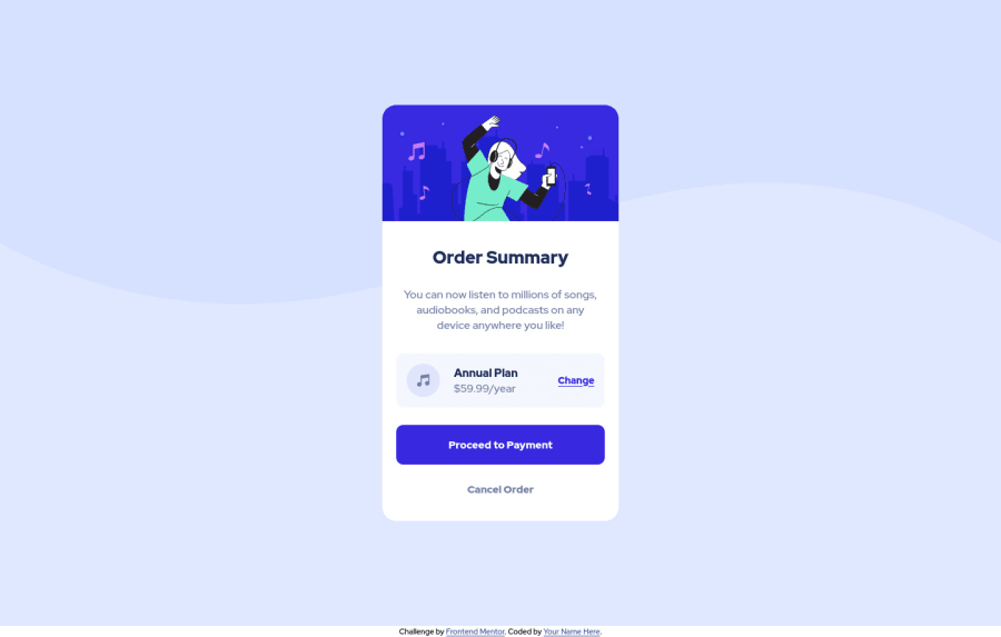
Responsive HTML & CSS project of an order summary component card
Design comparison
Solution retrospective
Hi, everyone!
This is my solution for order summary component card design using only HTML & CSS. I would really appreciate it if you gave some valuable feedback on my solution and how it could be improved.
One note from me is that the color of the "Process the payment" button and the "Change" link while hovering is not specified in the style guide document, that's why I choose something close to that color.
Community feedback
- @HikmahxPosted about 3 years ago
The website looks great. I think you should transfer the
background-color: hsl(225, 100%, 94%);to the body from the card main section so that the attribution appears inside the component. Also, you can add a little padding at the bottom of the attribution, maybe like 0.5rem or 2px, so it doesn't stick too close to the bottom.Marked as helpful0 - @EmmanuelHexerPosted about 3 years ago
Great work man.
0 - @NaveenGumastePosted about 3 years ago
hay! Zhansaule Telisheva Nice work
happy Coding😀
0 - @ZhansauleTPosted about 3 years ago
if the GitHub page link doesn't work, you can look at my solution here as well: https://zhtel.ru/order-summary-component/
0
Please log in to post a comment
Log in with GitHubJoin our Discord community
Join thousands of Frontend Mentor community members taking the challenges, sharing resources, helping each other, and chatting about all things front-end!
Join our Discord
