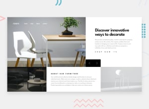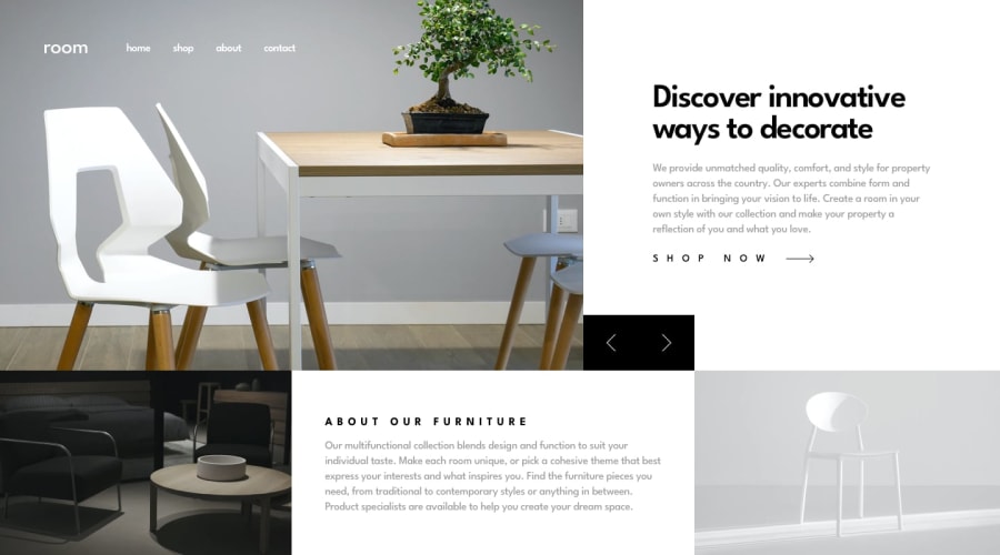
Design comparison
Solution retrospective
I took 4 hours to complete this responsive homepage and to recap what I've learnt so far.
In this challenge,
- I created an object in JS to contain information for slides, and I believe this makes my code look cleaner.
- I also use
<li></li>to create an indicator for image slide which is better user experience.
I hope you enjoy building code as I do, and I am always welcome any suggestions and collab opportunities.
Happy coding!☺️
Community feedback
- P@tedikoPosted over 3 years ago
Hello, MetisT! 👋
Great job on this challenge! I have a few suggestions to improve your solution:
- I am not a big fan of these box-shadows. This is my feeling but i think in this specific project simpler is better.
- You can easily rework your slider to be infinite. I mean, it won't stop after your reach last slide, but it will back to beginning of your slides. Try this code:
$('.arrow-left').click(()=>{
    if(i>0){
        i--
        imageSlide(i)
        checkSlideState(i)
    } else if (i <= 0) {
        i = 2;
        imageSlide(i);
        checkSlideState(i);
    }
})
$('.arrow-right').click(()=>{ if(i<2){ i++ imageSlide(i) checkSlideState(i) } else if (i <= 2) { console.log('hello'); i = 0; imageSlide(i) checkSlideState(i) } })- Your padding on
.upper-section .rightis too big on mobile version, instead of 80px try for example with 20px so your content isn't missplaced. - The same problem occurs with
.lower-section .middle-text. You can removemargin: 40px;from this element on mobile resolution.
Good luck with that, have fun coding! 💪
1 - @greatmetisPosted over 3 years ago
Thanks @tediko for your time!!
-
I totally agree with you about the box-shadows. That is a try although it's unsuccessful experience, I learnt the lesson from this. I thought it could make the buttons more attractive, while apparently I even doubt my own decision. 😅
-
Thanks for pointing out the problem for the layout in mobile screen. I didn't see the misplace of those sections. It's big shame for me while I have edit them, and thank you😀
-
In terms of infinite slides, I have thought about it. While the reason why I added the indicator for the slide is to let users know the slide has been the end. However, I do understand loop the slide could be more user friendly. So, I decided to stick with you suggestion!
To sum, I have learnt lots from this challenge, particularly the aspects of user-friendly and designer's eyes.
Again, I really appreciate your time on my challenge!!
0 -
Please log in to post a comment
Log in with GitHubJoin our Discord community
Join thousands of Frontend Mentor community members taking the challenges, sharing resources, helping each other, and chatting about all things front-end!
Join our Discord
