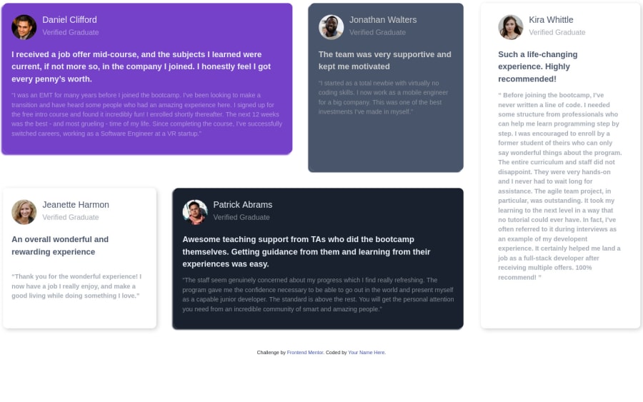
Design comparison
Solution retrospective
This is first time using bootstrap, I would love to get your feedback
Community feedback
- @ApplePieGiraffePosted over 4 years ago
Hey, Noha M.! 👋
Good work! 👍
I suggest,
- Adding some space to the sides of the content so that there's some room between the testimonial cards and the edges of the page (as in the original design).
- Breaking into a mobile-friendly layout a little sooner than 768px (or at least rearranging the layout a little) so that the content of the page doesn't look too squeezed right before the layout changes.
- Adding a subtle box-shadow (as in the original design) would be a good touch.
Keep coding (and happy coding, too)! 😁
2 - @yossefAlatterPosted over 4 years ago
You forget some details
1 - @Greeshma2903Posted over 4 years ago
Good start with Bootstrap!
You can add a class to
container-fluid, and add some margin to the page, to make it look cleaner.happy coding!!
1
Please log in to post a comment
Log in with GitHubJoin our Discord community
Join thousands of Frontend Mentor community members taking the challenges, sharing resources, helping each other, and chatting about all things front-end!
Join our Discord
