Not Found
Not Found
Not Found
Not Found
Not Found
Not Found
Not Found
Not Found
Not Found
Not Found
Not Found
Not Found
Not Found
Not Found
Not Found
Not Found
Not Found
Not Found
Not Found
Not Found

Submitted

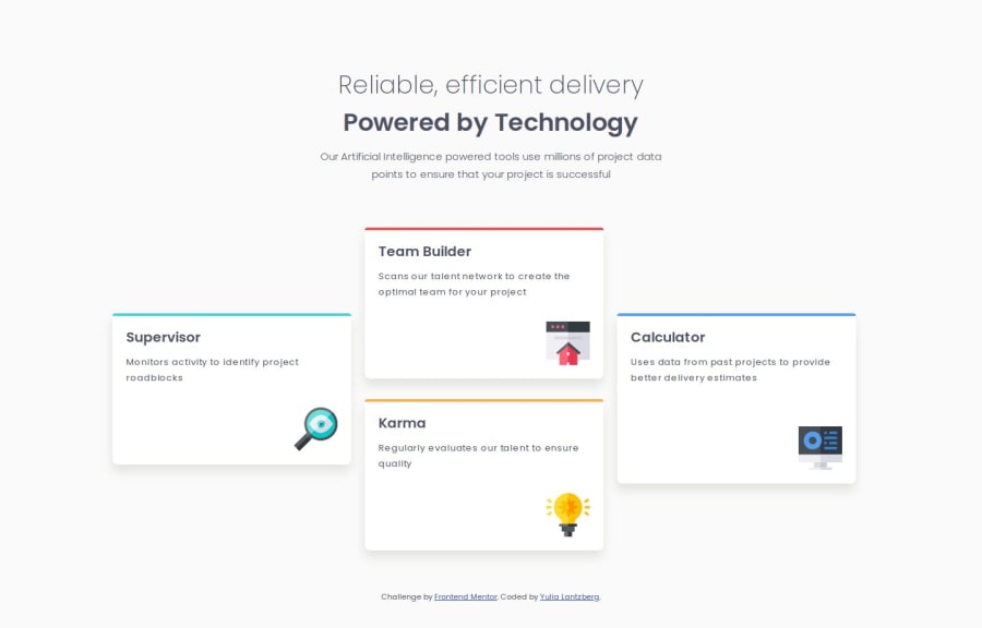
Responsive four cards page using grid and flex layouts and media query

Yulia 320

@YuliaLantzberg

Desktop design screenshot for the Four card feature section coding challenge

This is a solution for...

  • HTML
  • CSS
1newbie
View challenge

Design comparison


SolutionDesign

Solution retrospective


What are you most proud of, and what would you do differently next time?

This challenge forced me to learn and understand grid and flex layouts better, as well as the differences and use cases for them.

What challenges did you encounter, and how did you overcome them?

First I wanted to use flex layout to build the structure. I didn't find how to make it with flex so I moved to grid. And that made me understand that flex layout is more useful for dynamic and changing designs but grid layout is good for the structure.

Community feedback

MikDra1 5,990

@MikDra1

Posted

Nice one 😀

If you are curious how you can do this straight lines on the top of each card here is my tip:

Create another element in each of the cards. Then position this element absolute. Card should be positioned relative. At the end you need to give this element a height of 3px width of 100% and top 0 and left 0. You can also use ::after or ::before pseudo elements to create these.

Hope you found this comment helpful 💗

Good job and keep going 😁😊😉

Marked as helpful

1

Yulia 320

@YuliaLantzberg

Posted

@MikDra1 Hi. Thank uuuuuu. I was really thinking about it and here you came with the solution. I've implemented it. Thnx Thnx Thnx :-)

0
Darkstar 1,000

@DarkstarXDD

Posted

@YuliaLantzberg There's no need to create another element to get the colored border. You can use the border-top property on each card.

0
MikDra1 5,990

@MikDra1

Posted

@DarkstarXDD

Yes you can but on the design the border at the top is straight and the card has border-radius. If you then set the border-top your border will get border-radius which is not what we want.

1
Yulia 320

@YuliaLantzberg

Posted

@DarkstarXDD That is what I used first. But when we use the border-top then the rounded corners are seen more than in the original design. The approach that @MikDra1 suggested resolves this issue and makes the top border straighter and closer to the design

0
Darkstar 1,000

@DarkstarXDD

Posted

Looks good. But i see some foundational mistakes you are doing, that are usually fixed on much more smaller challengers.

  • Avoid setting fixed widths and heights on elements containing text. Fixed widths can prevent text containers from resizing properly in smaller screens, leading to overflow issues. Instead use a max-width in rem. This will make sure the container won't grow too large, but still will allow them to resize as needed when there is no room in smaller screens.
  • Avoid using percentage values. They give unpredictable results. One exception would be using something like width: 100% if you want an element to take up 100% of it's parents width. Other than that I usually use rem every where.
  • When the screen size shrinks, text wraps into new lines causing the container to increase its height automatically if needed. If you've defined a fixed height, the container can't adjust, leading to text overflow. So don't set a height on text containers. The browser will decide the height based on font size, padding, margins etc.
  • So the cards in this project shouldn't have any fixed widths or heights. You only need a max-width in rem on each card, or on the entire grid. I suggest you go through your QR code component challenge again and remove the fixed widths and heights set there too.
  • There's no need to change the font size on the html element. Most of the time you never need to change anything on the html element. That's just asking for trouble.
  • Start developing mobile first.
  • You don't need this many media queries. If you are using this many then that's a sign you are doing something wrong somewhere. Most of the time you will only need 1 media query for the desktop layout, and sometimes 2 if there's a different layout for medium size screens (tablets).
  • Avoid using ids to style. Always use classes to style. In this project, you can give each card a second class name like card--supervisor, card--calculator etc. to style individual cards.
  • I feel like the icons in this design are decorative images which brings no value for screen reader users. For decorative icons you keep the alt attribute empty like this. alt="".
  • No need to wrap the <img> in a <div>. Try to keep the HTML simple as possible.

Marked as helpful

0

Yulia 320

@YuliaLantzberg

Posted

@DarkstarXDD

Hi. I highly appreciate your detailed feedback.

  1. I took your advice and changed the width for max and min. It indeed saves some code lines and simplifies media queries
  2. I've never heard recommendations to avoid %. Both rem and % service different purposes. Here. for example, a link about it https://www.linkedin.com/pulse/understanding-css-units-rem-em-px-percentage-selecting-shams-saif-ts14c/. % is pretty predictable if to remember that it depends on its parent. Rem depends on the root font size and it's not always suitable or comfortable to calculate.
  3. I don't want the change of height to be unpredictable. It changes then the overall design.
  4. I change the font-size in HTML element to reduce it to 10px from the default 16 in the browser. It makes it much easier to work with rems when the root font-size is set to 10px and is a common practice.
  5. However, indeed, many recommend mobile-first approach, some professionals still prefer and advise sticking to the desktop-first approach. For example, Jonas Schmedtmann in his Advanced Css and Sass course. Anyway, both are recommendations and depend on use cases.
  6. It's not that necessary, indeed, to add so many media queries but I like to shrink and add some end-points to cover unpredictable screens. 7.I don't agree about ids. Ids are meant for unique cases and styles that will not be reusable when classes are needed for reusable styles. In this project, each card has its unique color, which means the style is specific for each card and it justifies using an id. And it doesn't prevent us from using these ids for js purposes if needed. 8.You are right about alts. I first left them empty but then the accessibility report here shouted and I added text. Removed it again now. 9.I use the wrapper for positioning the icons. And in general wrappers for imgs are comfortable to differentiate between styling image and its positioning. Again thank you so much for your valuable time spent on this feedback. Even though I didn't agree with all your comments but each of them made me to think and read deeper about all covered topics.
1

Please log in to post a comment

Log in with GitHub
Discord logo

Join our Discord community

Join thousands of Frontend Mentor community members taking the challenges, sharing resources, helping each other, and chatting about all things front-end!

Join our Discord