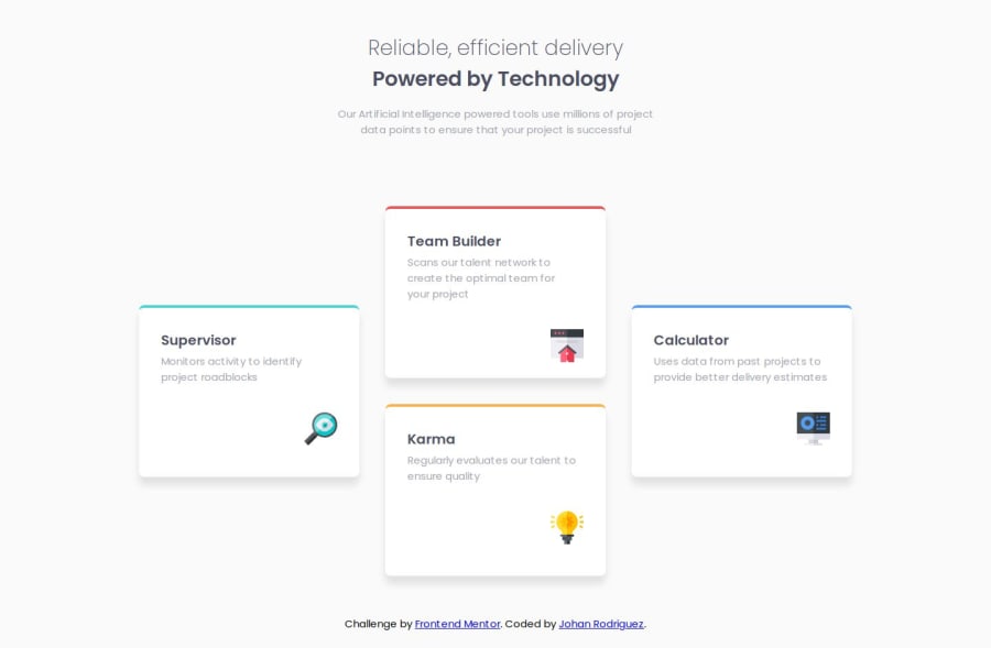
Responsive four card feature section using CSS Grid
Design comparison
Solution retrospective
I could finished this project quickly and organize all the elements properly to make the layout responsive. Next time, I would decide better between using flexbox or grid to avoid problems.
What challenges did you encounter, and how did you overcome them?It was difficult to make the layout responsive using CSS Grid, because I wanted to avoid using media queries, but in the end I had to use them and could finished the responsive design.
Community feedback
- @Grimm-NPosted 6 months ago
Hi, first off — major props! 🎉 That code is slick! Clean, organized, and I love how you separated out your CSS. Gonna steal that trick for sure. 😎
Now, just a lil' tip: when writing HTML, if the line is short, no need to break it into three pieces. Makes it kinda tricky to follow, you know? Keep it tight, keep it smooth! 😎
Oh, and about those long, fancy class names like "
card-container__card-title" — no need to go all out like that. You can just go with two separate classes, like "card-container card-title". Way easier to handle.For that sweet responsiveness, try using %, em, rem, vh, vw and the gang. That way your design can vibe with different screen sizes all by itself. 🖥️📱
But seriously, overall — killer job! I’m a fan! 🔥 Keep it up! 👏
Marked as helpful1@jdrodriguez2707Posted 6 months agoHey @Grimm-N 👋🏻, thank you so much for the feedback. I really appreciate it. I'll take into account all the tips you gave me. Regarding the class names, I used that approach to practice the BEM metodology for naming classes, but I realize it's more suitable for bigger projects. Again, thanks so much for your feeback, and I wish you the best with your projects.
1
Please log in to post a comment
Log in with GitHubJoin our Discord community
Join thousands of Frontend Mentor community members taking the challenges, sharing resources, helping each other, and chatting about all things front-end!
Join our Discord
