Responsive Four Card Feature Section Solution using Flexbox and Grid


Design comparison

Solution retrospective
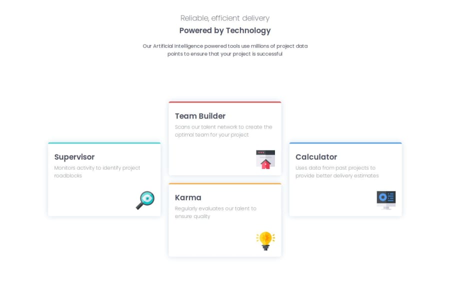
This project was a bit challenging because trying to figure out which layout to use after the mobile design can be a bit challenging. I can go with the Flexbox approach where I create three columns and then stack up the two cards in the middle. Or I can go with the Grid approach where I just create one row and stack up the two cards in the middle. I eventually went with the grid layout since going from mobile to desktop would be easier to implement than with flexbox.
Community feedback
- @AllanKyleVPosted 25 days ago
It looks clean and awesome. The page adapts seamlessly to different screen sizes. Great job choosing CSS Grid for the layout—it’s an excellent choice for stacking child elements (card) of the parent (card-wrapper) in accordance to the challenge preview.
0

Please log in to post a comment
Log in with GitHub
Join our Discord community
Join thousands of Frontend Mentor community members taking the challenges, sharing resources, helping each other, and chatting about all things front-end!
Join our Discord