Responsive Four-Card Feature Section - SCSS/SASS CSS HTML5 Mobile-F
Design comparison
Solution retrospective
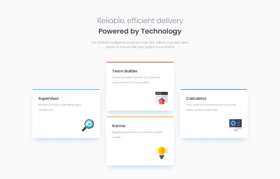
The main challenge I encountered was figuring out how to distribute the display blocks as the screen size decreased. Initially, I used Flexbox as the foundation, but I found it difficult to manage the layout effectively when the screen size shrank. After considering various options, I ultimately transitioned to using CSS Grid. This allowed me to stack the elements in a single column in a more efficient way, simplifying the layout management as the screen size adjusted.
Community feedback
- P@ValsCodesPosted 6 months ago
The Desktop Version is perfect! The mobile one though can use some work as it's not quite like the design. Still great work. The solution uses sematic html, code and folders are well structured and looks reusable.
0
Please log in to post a comment
Log in with GitHubJoin our Discord community
Join thousands of Frontend Mentor community members taking the challenges, sharing resources, helping each other, and chatting about all things front-end!
Join our Discord
