Submitted 5 months ago
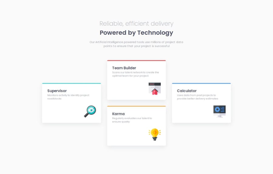
Responsive Four Card Feature Section - Mobile First Workflow

@Unifies

Design comparison
SolutionDesign

Community feedback
- @hitmorecodePosted 5 months ago
Nice well done. One thing that you can fix. The borders on top are bending with the border radius of the cards. Change this in your CSS to fix this.
.flexchild {
  background-color: var(--White);
  border-radius: 10px;
  box-shadow: rgba(149, 157, 165, 0.2) 0px 8px 24px;
  text-align: left;
  padding: var(--fs-17);
  /* add these two lines  */
  position: relative;
  overflow: hidden;
}

.flexchild::before {
/*   border-top: 5px solid var(--Cyan); */
  content: "";
  position: absolute;
  top: 0;
  left: 0;
  height: 5px;
  width: 100%;
}

.cyan::before {
/*   border-top: 5px solid var(--Cyan); */
  background-color: cyan;
}

.red::before {
/*   border-top: 5px solid var(--Red); */
  background-color: red;
}

.orange::before {
/*   border-top: 5px solid var(--Orange); */
  background-color: orange;
}

.blue::before {
/*   border-top: 5px solid var(--Blue); */
  background-color: blue;
}
I hope you find this helpful. Keep it up 👌👍
Marked as helpful0@UnifiesPosted 5 months agoHi @hitmorecode,
I did find it helpful, thank you so much for the helpful feedback!
0


Please log in to post a comment
Log in with GitHub
Join our Discord community
Join thousands of Frontend Mentor community members taking the challenges, sharing resources, helping each other, and chatting about all things front-end!
Join our Discord