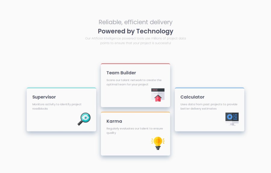
Design comparison
Community feedback
- P@Kiara523Posted 4 months ago
Your solution looks good and pretty close to the original one. The variable are very well organized and easy to read, also you ahve named the classes is pretty clear way. I would suggest to keep specificity on the same level as much as possible to avoid rules to be overridden by using more specific name for the element itself, an example the ".header h2 " it has an higher specificity, but giving it a class name would lower it, example header__title.
Giving specifics width and height it can be dangerous as you did here.. '#container { width: 1272px; height: 735px; display: flex; flex-direction: column; justify-content: space-between; }' give a max-width and let the browser figure out the height can be a possibility, it helps with responsiveness.
Great job over all. Well done!! I enjoying seeing how the same project can have different solution...
1
Please log in to post a comment
Log in with GitHubJoin our Discord community
Join thousands of Frontend Mentor community members taking the challenges, sharing resources, helping each other, and chatting about all things front-end!
Join our Discord
