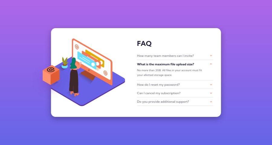
Responsive FAQ Accordion Card using flexbox & css position properties
Design comparison
Solution retrospective
This newbie wasn't as easy as it seems xD especially when it comes to positioning multiple images on different screens but I had fun doing this challenge!
The screenshot is still showing missing card background even after I updated it so I suggest you preview the site!
Things I look forward to:
- mobile first approach as it makes the codes more neat and tidy and faster when adjusting media queries
Any feedback would be great! I'm open to both improvements to the output and shorter codes as much as possible.
Community feedback
- @isprutfromuaPosted over 2 years ago
Hi there. You did a good job 😎
keep improving your programming skills🛠️
your solution looks great, however, if you want to improve it, you can follow these recommendation:
**HTML**
✅ Avoid complex wrapping. For better performance please tried to avoid unnecessary wrapping. It will create unnecessary node in your HTML tree and reduce performance too.
<div class="card__ques open"> <div class="card__header"> <h2>What is the maximum file upload size?</h2> <i class="uil uil-angle-down icon"></i> </div> <div class="card__desc"> <p> No more than 2GB. All files in your account must fit your allotted storage space. </p> </div> </div>
✅ Follow a consistent HTML format. It is important to remain consistent in your HTML style. You can use prettier to help you with that but the goal is to always follow a consistent way you code your markup.
<div class="pics-container"> <picture class="pics-woman"> <- Dash case naming <source media="(min-width: 968px)" srcset="images/illustration-woman-online-desktop.svg"> <source media="(max-width: 968px)" srcset="images/illustration-woman-online-mobile.svg"> <img class="card__woman" src="images/illustration-woman-online-desktop.svg" alt="illustration-of-woman"> <- BEM </picture> <div class="card__header"> <h2>What is the maximum file upload size?</h2> <- no css classes <i class="uil uil-angle-down icon"></i> <- no css classes </div>
**CSS**
✅ Use a CSS reset . By default, browsers don’t apply the same default styling to HTML elements, a CSS reset will ensure that all element have no particular style. For example: css-reset
✅ Write consistent CSS. At the beginning part of the project you can set some rules for maintain throughout to your entire stylesheet. If you follow the convention or BEM, you’ll be able to write CSS without being afraid of side effects.
✅ Use rem’s or em’s. Using rem’s or em’s is more dynamic way instead of using pixels. Try to use rem’s or em’s rather than pixels.
.card__woman { max-width: 500px; } .card__bg { position: absolute; max-width: 900px; -webkit-transform: translate(-100%, -36%); transform: translate(-100%, -36%); }
✅ Don’t use @import . The @import directive is much slower than the other way to include stylesheets into a html document:
<link rel='stylesheet' type='text/css' href='a.css'> <link rel='stylesheet' type='text/css' href='font.css'>
✅ Avoid Extra Selectors. Adding extra selectors won't bring Armageddon or anything of the sort, but they do keep your CSS from being as simple and clean as possible.
.card .pics-container .card__header h2 .card__header .icon
✅ Use Clamp . The clamp function make smaller and simple CSS to control element width.
width: clamp(100px, 50%, 300px);
✅ Use CSS Variables . Making the code flexible is equally important so that refactoring won’t be a problem for you. One of the best ways to achieve this is variables.
I hope my feedback will be helpful. You can mark it as useful if so 👍 it is not difficult for you, but I understand that my efforts have been appreciated
Good luck and fun coding 🤝⌨️
Marked as helpful1
Please log in to post a comment
Log in with GitHubJoin our Discord community
Join thousands of Frontend Mentor community members taking the challenges, sharing resources, helping each other, and chatting about all things front-end!
Join our Discord