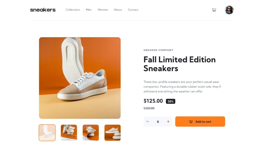
Design comparison
Community feedback
- @menoo20Posted almost 3 years ago
I would be a liar if I didn't say that this is one of the best designs I have seen so far for this challenge. actually, all the functions are working at their best what makes me feel like you have the taste of a backend dev more than a frontend one. although you could make the style similar to the original to great extent, I find that you didn't give much attention to the animation and transitions and ideas like that which may make the design more alive from being just a good shape. I am talking about that point because a dev in your level is pretty sure able to draw any animation he likes if he wants. that's why I recommend u that the only thing you need here is more interactivity. even if it is not asked for but consider it a skill of making a piece of art. if you saw my design u will find that I give great interest to such things but am not as good as you in functionality but I hope to be ...thanks for such a great design.
Marked as helpful0@mariamoraanPosted almost 3 years ago@menoo20 Thank you for your feedback Mohammed ! I will implement animations soon !
1 - @skyv26Posted almost 3 years ago
Pretty good work,Seems similar to the design preview
Marked as helpful0
Please log in to post a comment
Log in with GitHubJoin our Discord community
Join thousands of Frontend Mentor community members taking the challenges, sharing resources, helping each other, and chatting about all things front-end!
Join our Discord
