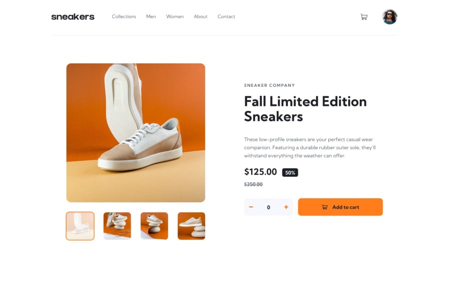
Design comparison
SolutionDesign
Solution retrospective
How do you see my code and overall UI?
Community feedback
- @PhantomOzPosted over 2 years ago
Nice job Rob, here is my feedback:
- Good job trying to write semantically but, there are some areas where you could have placed semantic elements.
- You should try fixing your 'accessibility' issues by formatting your code well.
- You should try fixing your 'HTML' issues by:
- This code in the header
<a href="##"> <img class="logo" src="" alt="Sneakers logo"> </a>you should remove the second#in thehrefattribute. - This code also ```<button type="button" class="btn add-to-cart-btn"> <p>Add to cart</p> </button>``` you can't have a block element `p` in an inline element `button` you should fix it.
- This code in the header
- The layout looks good on both Desktop and mobile screens but, I think you can still work on the typography especially the
font-weightandfont-sizeof some of the element so it resembles the design. The logo also looks chopped off underneath usually on Desktop screens. - You should also structure your code well.
Good Job by the way 👍, I hope you found this feedback helpful.
1
Please log in to post a comment
Log in with GitHubJoin our Discord community
Join thousands of Frontend Mentor community members taking the challenges, sharing resources, helping each other, and chatting about all things front-end!
Join our Discord
