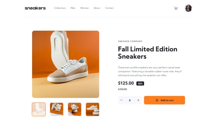
Design comparison
Solution retrospective
I tried Next.js for the first time. It is messy code but take a look and suggest me how to improve my code please.
Community feedback
- @skyv26Posted almost 3 years ago
Hi! Samir, I saw your work and I am not familiar with Next.Js , I am learning React right now. But I also made this project using React.js, so I can tell you issues that I have noticed in your work from CSS ,html and design point of view.
-
You did good work but not as per requirement or simply I can say not made in comparison to provided design, like you cart in empty state is looking so weird and it need some border color in order to differentiate it from rest of design.
-
Your black overlayed slider's arrows are not visible properly, try to use pseduo classes ::after, ::before in order to apply arrow white background.
-
In mobile view your design is messed up little bit, header image is too big as compared to other elements in header.
-
I tried to add some item and then I click on cart in mobile view, and suddenly your cart appears but it your layout shift little towards left hand side.
-
You need to add black overlay in mobile navigation, so that user only interact with menu not with other at same time, I mean, I can open the navigation bar and also can click on your cart at same time.
There are few issues more like HTML have 35 issues. I hope you understand and soon will fix your issues.
Best of Luck
0 -
Please log in to post a comment
Log in with GitHubJoin our Discord community
Join thousands of Frontend Mentor community members taking the challenges, sharing resources, helping each other, and chatting about all things front-end!
Join our Discord
