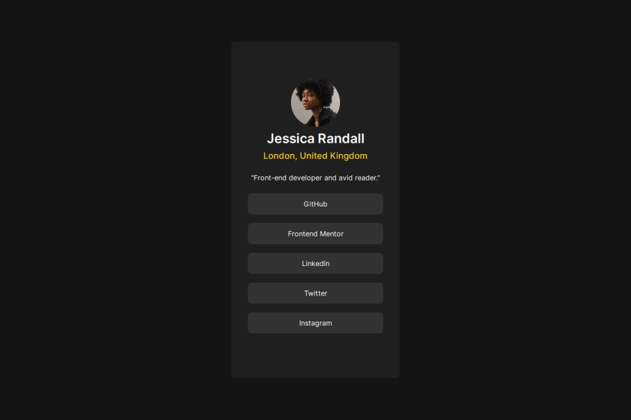
Design comparison
SolutionDesign
Solution retrospective
What are you most proud of, and what would you do differently next time?
The hardest part was the responsiveness of the website. I did my best although the current solution is not optimized for responsiveness.
What challenges did you encounter, and how did you overcome them?THE RESPONSIVE WEB DESIGN
What specific areas of your project would you like help with?Please give me some recommendations on how to improve my responsive design thinking.
Community feedback
- @ValsCodesPosted 3 months ago
1 Yes. 2 It is, the colors, fonts are a bit off. Hovering on the button doesn't do do anything, but if the user didn't have the design this is fine. 3 Size is somewhat okay. The fonts are a bit larger than the design 4 Probably hard to be reused, it's a bit hard for me read all that is going on there 5 around 30% of a difference
0
Please log in to post a comment
Log in with GitHubJoin our Discord community
Join thousands of Frontend Mentor community members taking the challenges, sharing resources, helping each other, and chatting about all things front-end!
Join our Discord
