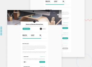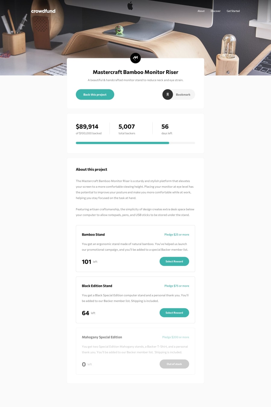
Responsive design using styled-components, typescript, next js
Design comparison
Solution retrospective
This is my first build in the next js framework and styled component. I am open to any kind of suggestion on how to improve workflow and of course feedback.
Community feedback
- Account deleted
I think you should change the "bookmark/bookmarked" to click, instead of hover.
And I'm not why clicking on 'select reward' automatically scrolls you to the top. It's not a problem but it's weird.
Good solution, and keep coding.
1@avatarfreakPosted over 3 years ago@thulanigamtee thanks for pointing out the bookmark portion. I did not realize. yeah, on the scrolling part, it is the background body, which scrolled to the top. I was trying to follow the given design. Appreciate your feedback.
0 - @mbart13Posted over 3 years ago
I would suggest to check your project on various devices (there are tools for that), currently on larger screens your background image doesn't take the whole space
0@avatarfreakPosted over 3 years ago@mbart13 I have limited to 1440px width. Thanks for the feedback.
0
Please log in to post a comment
Log in with GitHubJoin our Discord community
Join thousands of Frontend Mentor community members taking the challenges, sharing resources, helping each other, and chatting about all things front-end!
Join our Discord
