


Raymart Pamplona• 16,120
@pikapikamart
Posted
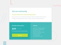
Hey, awesome work on this one. Though for desktop state, the layout is too wide and if you try to zoom out, you will see that the layout doesn't really respond well and just kind of makes the content out of place. For mobile state, it looks fine but it could use more width since it is small.
Besides Aakash Verma great feedback, here are some other suggestions:
- Don't use
width: 100vwsince this will only add a horizontal scrollbar at the bottom, since this value does not account the vertical scrollbar's width. - Avoid using
height: 100vhon a large container like themainas this makes the element's height capped based on the viewport/screen's height. Instead usemin-height: 100vhso that the element will expand if it needs to. - Remove the
.container'sheight: 50vw. Also, just in general, you don't want to just usevhunit inheightorfont-sizeor just in other since it is not consistent and will vary depending on the user's screen-size. It would be better to userem. Not saying thatvhis bad, but using it should be properly controlled. - The
h3after theh1could just be replaced byptag since theh1is enough for that section. But if you insist on using heading tag, go withh2. When using a heading tag, make sure you are not skipping a level. If you useh4then make sure thath1, h2, h3are all present. Monthly Subscriptionshould be usingh2and noth3and the pricing should just be aptag since the heading tag above it already gives information on that section's content.Why usshould beh2as well.- Those information on the
Why ussection, as you can see, those are "list" of things on why the user should "choose" them. Meaning, aulon it would be really nice and not a singleptag to wrap the whole text. - Lastly, just addressing the styling on the overall layout.
Aside from those, great job again on this one.
Marked as helpful
0
Neha Nalini Kennedy• 100
@nehanalinik
Posted
@pikapikamart Thanks for really breaking down and explaining it.
- I guess
height: 100vhdid not help. - I should checkout more about
min-height - Really helpful how you have given an insight on heading tags, they should be inorder else it's not necessary. Instead use
ptags - I did not really checked the
Why ussection haslitags.
1

