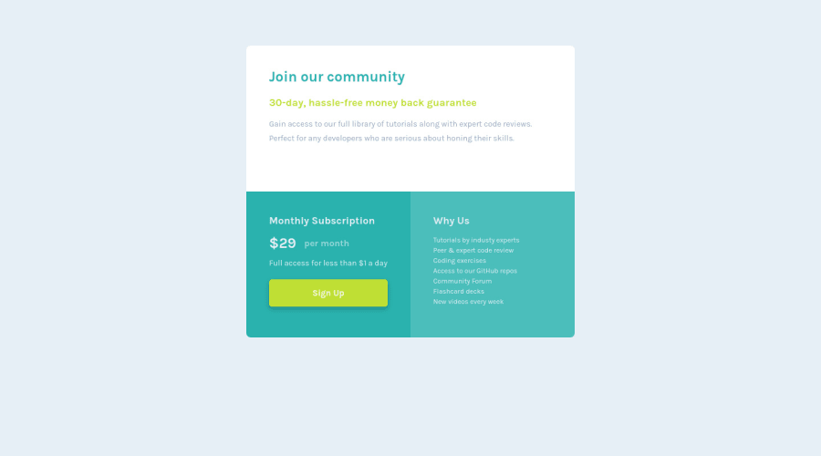
Submitted over 3 years ago
Responsive Card using HTML, CSS (Grid layout, variables)
@dusanlukic404
Design comparison
SolutionDesign
Solution retrospective
Any feedback or suggestion will be very helpful :)
Community feedback
- @elidrissidevPosted over 3 years ago
Good job Dusan! I have a few suggestions for you:
- First I recommend to indent your html properly so that other people can read it easily.
- I also suggest to take a look in "Accessibility Issues", it can help you find issues with your solutions.
- I see you've gone from using an
h1to using anh3, skippingh2. Heading levels help set a content hierarchy for your page, so it is better that you follow them from 1 to 6. - For the "Why Us" section, the content is a list of reasons why choose this fictional service. Since it is a list, I would have used the semantic
ulelement, instead of just a paragraph with line breaks, then you can style it to match the design. - Last thing, I noticed the extra space below the top white section, which can be fixed by removing the
height: 80%from.containerto make the card's height adjust to fit the content.
Good luck!
Marked as helpful1 - @hafizanadliPosted over 3 years ago
Great solution! One thing you could improve is using semantic html
Keep up the good work!
1
Please log in to post a comment
Log in with GitHubJoin our Discord community
Join thousands of Frontend Mentor community members taking the challenges, sharing resources, helping each other, and chatting about all things front-end!
Join our Discord
