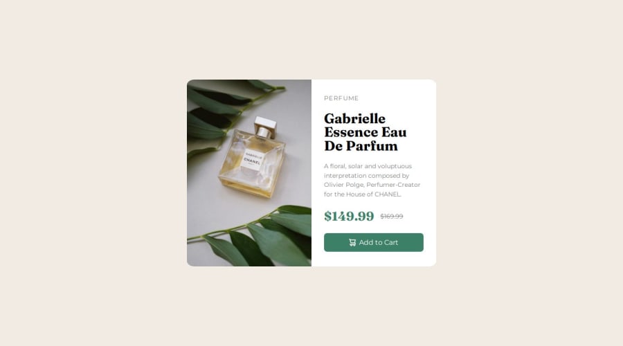


Design comparison

Solution retrospective
I have learned how to appy media query and make the code responsive, also a bit of flexbox nuances.
What challenges did you encounter, and how did you overcome them?Flexbox was acting a bit weird why i added padding to the child so after a lot of search applying flex-basis fixed it.
What specific areas of your project would you like help with?- I used vw for making the text responsive, was that correct.
Community feedback
- @dar-juPosted 4 months ago
Hi!
Good job!
About your question. Not quite the right solution about relative font size, because the layout remains static when zoomed. For example, I have poor eyesight and try to zoom in using Ctrl + mouse wheel, it won't work here. Better use pixels or rem.
I noticed how you replace the picture for the mobile version, this method is good if you manage content using JS. In HTML there is a picture tag for this. See how tag picture works.
As for the tags, look, in this task there is only one tag p - paragraph, this is the description of the product. There is also a title - the name of the product, use the H tag. Everything else here is span. Semantically, this will be correct. Search engines and readers will be able to understand exactly what is here.
The same applies to the button, there is a button tag for it.
Also, search engines and readers look at what is written in the alt - you need to write more specifically there. If you decided to connect the cart icon via the img tag, and not via the css background-image, then the alt tag should be left blank.
Good luck with your projects!
Marked as helpful1@abdushskPosted 4 months ago@dar-ju For the solution, learned a lot. Now it actually makes sense when rem is important for sizes.
0 - @hitmorecodePosted 4 months ago
Nice well done. Just a few tips.
- Avoid using % for width or height of cards. When switching to mobile screen size the card shrinks before it grows again. This will not look good on an actual page.
- Avoid using % for border radius when you just want to round the corners.
- You don't have to use position to place the card in the center of the page. You can easily do this with flexbox. Just add a min-height of 100vh on the body and add flexbox on the body.
- There are no headers on your page.
I hope you find this helpful. Keep it up👍👌
0


Please log in to post a comment
Log in with GitHub
Join our Discord community
Join thousands of Frontend Mentor community members taking the challenges, sharing resources, helping each other, and chatting about all things front-end!
Join our Discord