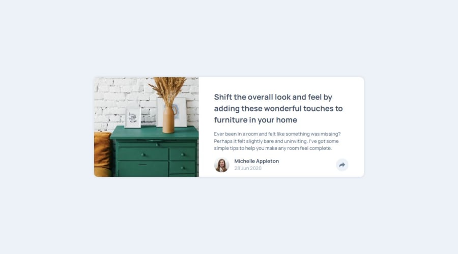


Design comparison
SolutionDesign

Community feedback
- P@ldgPosted 10 days ago
Nice work on this challenge solution, your code was very readable and the layout works on a variety of screen widths, although the layout seems to go from phone to desktop, without styling for tablets.
Some suggestions: you could improve accessibility by using semantic markup, this will help with screen readers. For example the #author div, could be written as
<footer>rather than a<div>. Additionally you could wrap the h1 in a<header>tag.Marked as helpful1

Please log in to post a comment
Log in with GitHubJoin our Discord community
Join thousands of Frontend Mentor community members taking the challenges, sharing resources, helping each other, and chatting about all things front-end!
Join our Discord