Design comparison
Solution retrospective
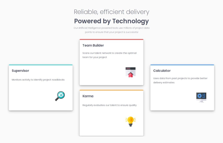
I am most proud of being able to use CSS Grid to build a responsive layout especially with the Grid-template-areas.
What challenges did you encounter, and how did you overcome them?One challenge i encountered was using the @font-face property after i downloaded it, but i was able to use it by reading about web-fonts on W3schools. Another challenge was using the justify-items and align-items property to manipulate grid items, thanks to Webos for his comprehensive course on CSS Grid which helped me to understand how to use Grid.
What specific areas of your project would you like help with?Any idea on where i can improve will be much appreciated
Community feedback
- P@miedzygalaktycznygitPosted 6 months ago
Hello Your project looks good but I have some ideas for You to test out.
- Try to use "sass" next time it may inprove Your cooding
- Try to make Your cards not changing size while website size changes I personaly made it by using (height: rem; and width rem;) so Your cards will always be the same like in design
- Using the "font-display: swap" property in the @font-face rule improves page performance. Instead of waiting for a custom font to load, the page displays text using a fallback font
0
Please log in to post a comment
Log in with GitHubJoin our Discord community
Join thousands of Frontend Mentor community members taking the challenges, sharing resources, helping each other, and chatting about all things front-end!
Join our Discord
