

Design comparison
SolutionDesign

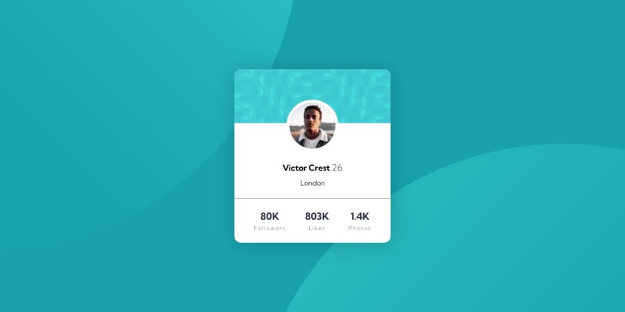
Community feedback
- @skyv26Posted 2 months ago
Hi @GaZtuki,
Great job on the project! 🎉 Here are a couple of suggestions that could help improve your code:
- Use background images instead of
imgfor decorative elements: Since the images you're using (bg-pattern-top.svgandbg-pattern-bottom.svg) are meant for decoration, it's better to set them as background images in CSS instead of as main content. This way, the images won’t interfere with the structure and accessibility of your page.
.main {
    background-image: url('images/bg-pattern-top.svg'), url('images/bg-pattern-bottom.svg');
    background-position: top, bottom;
    background-repeat: no-repeat;
    background-size: cover;
}
This ensures your layout remains clean and semantic. 👍
- Use
<span>for metrics inside the paragraph: Instead of using<p>tags for both the number and the label (like "Followers"), you can use a<span>for the label. This will make your HTML structure cleaner and more semantically correct:
Refactor this:
<div class="stats">
    <p class="stat">80K</p>
    <p class="info">Followers</p>
</div>
To this:
<div class="stats">
    <p class="stat">80K <span class="info">Followers</span></p>
</div>
This structure allows better control over styling and accessibility, while keeping the metrics grouped together. 📊
You're doing awesome work—keep it up! Looking forward to seeing more! 🚀
0 - Use background images instead of

Please log in to post a comment
Log in with GitHubJoin our Discord community
Join thousands of Frontend Mentor community members taking the challenges, sharing resources, helping each other, and chatting about all things front-end!
Join our Discord