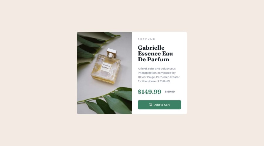
Design comparison
Solution retrospective
I am open to any feedback on this. In particular any accessibility points that I may have missed.
Community feedback
- @hitmorecodePosted over 1 year ago
Congratulations well done. I took a look at your page and I have a few tips.
- If you change the breakpoint to 650px you wont have so much empty space on the sides of the screen.
- Right now you have five media queries. You don't need this much, you could have done it with just one media query
1@frontendstuPosted over 1 year ago@hitmorecode 👋
Thanks for your feedback. I'll have a look into the 650px breakpoint. I'm not sure why I didn't use a smaller one in the first place. I'll adjust this.
I write so many media queries to keep them organised with their respective classes. I'm not sure if this is bad practice so any advice on that is welcome ☺️
0@hitmorecodePosted over 1 year ago@frontendstu The thing is all five media queries have the same min-width, so there is no point in using that many. The only time you use more media queries is when you want each media query to behave in a different way.
1
Please log in to post a comment
Log in with GitHubJoin our Discord community
Join thousands of Frontend Mentor community members taking the challenges, sharing resources, helping each other, and chatting about all things front-end!
Join our Discord
