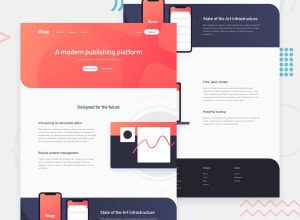
Submitted almost 2 years ago
Responsive Blogr landing page with vanilla CSS & JS
#accessibility#vite
@HassanMak29
Design comparison
SolutionDesign
Solution retrospective
Any feedback is welcome!
Community feedback
- @HikmahxPosted almost 2 years ago
Hi Hassan 👋. Great solution! I have one suggestion. I noticed when checking the website, after the breakpoint of 500px, it sort of acted up. I was thinking maybe you should increase the max-width of the breakpoint from 500px to perhaps 800px or so to make the site more responsive. Hope this was helpful
Marked as helpful1
Please log in to post a comment
Log in with GitHubJoin our Discord community
Join thousands of Frontend Mentor community members taking the challenges, sharing resources, helping each other, and chatting about all things front-end!
Join our Discord
