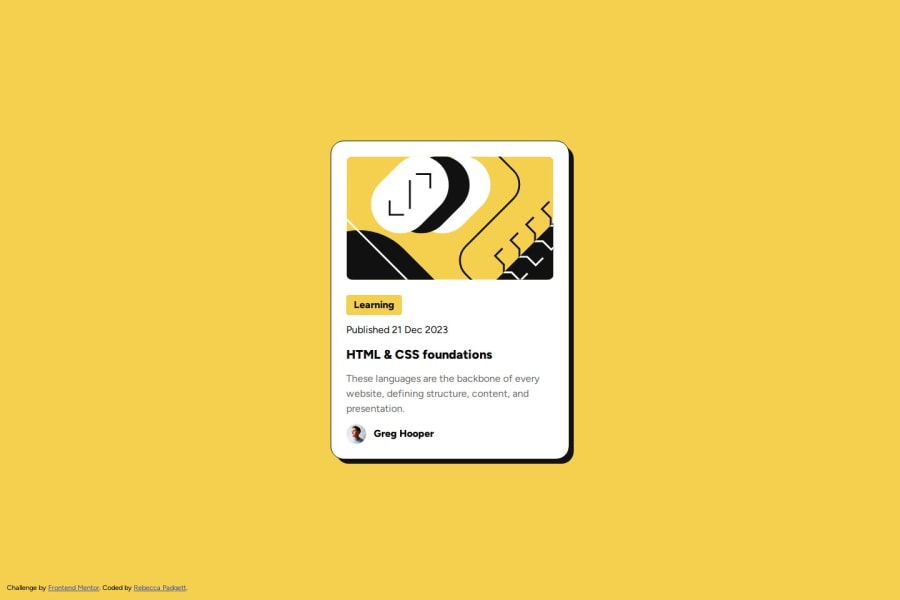
Responsive Blog preview card using HTML and CSS
Design comparison
Solution retrospective
For the paragraph, I made the gray color darker to fix the accessibility issue.
All feedback is welcome.
Community feedback
- @carter212-starPosted 4 months ago
I think the font-size of the heading is a bit different from the design. Thanks for reading my comment.
0 - @hitmorecodePosted about 1 year ago
Nice looks good well done. I took a look at your markup and I see you have the same problem I had with the image. The max-width: 100% is breaking the border radius. If you remove max-width: 100% and adjust the width and height of the image, it should solve this problem.
That's why I removed the image from the html and added in the CSS. Looking closer to what you did, if I use display: block then it should solve my problem also.
Good job keep it up
0@bccpadgePosted about 1 year ago@hitmorecode
Thank you for the feedback. I played around in the devtools and placed
height: auto;on.card-banner imgand the border-radius looks fine. I updated my code as well.0
Please log in to post a comment
Log in with GitHubJoin our Discord community
Join thousands of Frontend Mentor community members taking the challenges, sharing resources, helping each other, and chatting about all things front-end!
Join our Discord
