Submitted 2 months ago
Responsive Blog Preview Card using Clamp for responsive font size

P
@AnonymousCoder323

Design comparison
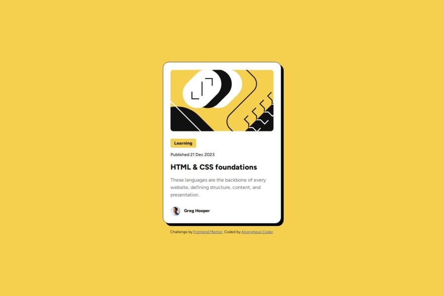
SolutionDesign

Community feedback
- @skyv26Posted 2 months ago
Hi @AnonymousCoder323, 👋
Great job on your project! Let me share some feedback and suggestions to help you refine your work further:
🎨 Design
- 🌟 Amazing Match: Your design perfectly aligns with the requirements—well done on maintaining the intended look and feel!
🏗️ HTML
- 🔍 Simplify for Clarity: Your HTML structure is solid, but simplifying it further can enhance readability and maintainability. Cleaner code will also help minimize CSS usage while achieving the same results. 🚀
📚 Naming Conventions
- ✔️ Good Practice: The naming conventions you’ve used are meaningful and easy to understand, which is key for readability. 👍
- 🌟 Subjectivity in Names: Remember, there’s no absolute right or wrong here—as long as the names are intuitive and descriptive, you’re doing great!
🌈 Variables
- 👍 Clear Naming: Your variable names are thoughtful and self-explanatory. They make the purpose of each value very clear.
- 💡 Suggestion: For
--white, consider adding context like--background-whiteif its primary use is for a specific element, to avoid ambiguity in larger projects.
Keep up the fantastic work 💪😊
Marked as helpful0P@AnonymousCoder323Posted 2 months ago@skyv26 Thanks for the feedback Aakash! I really appreciate it. I wanted to know more about how I could simplify my HTML. Was there anything in particular that you thought wasn't so readable?
1@skyv26Posted 2 months ago@AnonymousCoder323 You can reduce the html code, in my opinion.
0

Please log in to post a comment
Log in with GitHubJoin our Discord community
Join thousands of Frontend Mentor community members taking the challenges, sharing resources, helping each other, and chatting about all things front-end!
Join our Discord