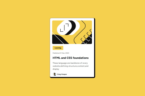
Submitted over 1 year agoA solution to the Blog preview card challenge
Responsive blog preview card using bootstrap
bootstrap

@G-Gakii
Solution retrospective
What are you most proud of, and what would you do differently next time?
I am glad I was able to create a responsive website using Bootstrap.
What challenges did you encounter, and how did you overcome them?- I did not know how to add svg images in HTML.
- I overcame this by googling how it's done.
While making my page responsive, I noticed the background colour is lost. I tried adding the background colour in the media query, but it still is not restored. How can I fix this issue?
Code
Loading...
Please log in to post a comment
Log in with GitHubCommunity feedback
No feedback yet. Be the first to give feedback on Gakii's solution.
Join our Discord community
Join thousands of Frontend Mentor community members taking the challenges, sharing resources, helping each other, and chatting about all things front-end!
Join our Discord