Submitted 2 months ago
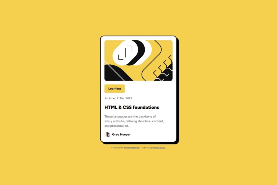
Responsive blog preview card made with css flexbox and media query
#accessibility

P
@okayishmael

Design comparison
SolutionDesign

Solution retrospective
What are you most proud of, and what would you do differently next time?
-
Usually the blog card is line up with others. So I included s css scale transform for the card to increase in size when user hovers over the card to triggers that its interactive.
-
Knowing media query is big deal for me. Most of the the world's conversations are done via mobile phones. Being able prepare web app the is mobile friendly is huge.This means I am able to deliver content to people on the go all around the world.
@media (min-width: 500px){
    body{
        display: flex;
        justify-content: center;
        align-items: center;
        flex-direction: column;
        height: 100vh;
    }

    .container{
        width: 384px;
        margin-bottom: 1.25rem;

        &:hover{
            transition-duration: 0.5s;
            transform: scale(1.01);
        }
    }

}
I was also able to the follow for the first time:
- configure git with user name and email
- initialize repository
- stage add and commit files
- create a branch to edit card button link
- merge the branch to the main repository
- publish files
- create gh page for live site
Configurating git with my username and email.
What specific areas of your project would you like help with?N/A
Community feedback
Please log in to post a comment
Log in with GitHub
Join our Discord community
Join thousands of Frontend Mentor community members taking the challenges, sharing resources, helping each other, and chatting about all things front-end!
Join our Discord