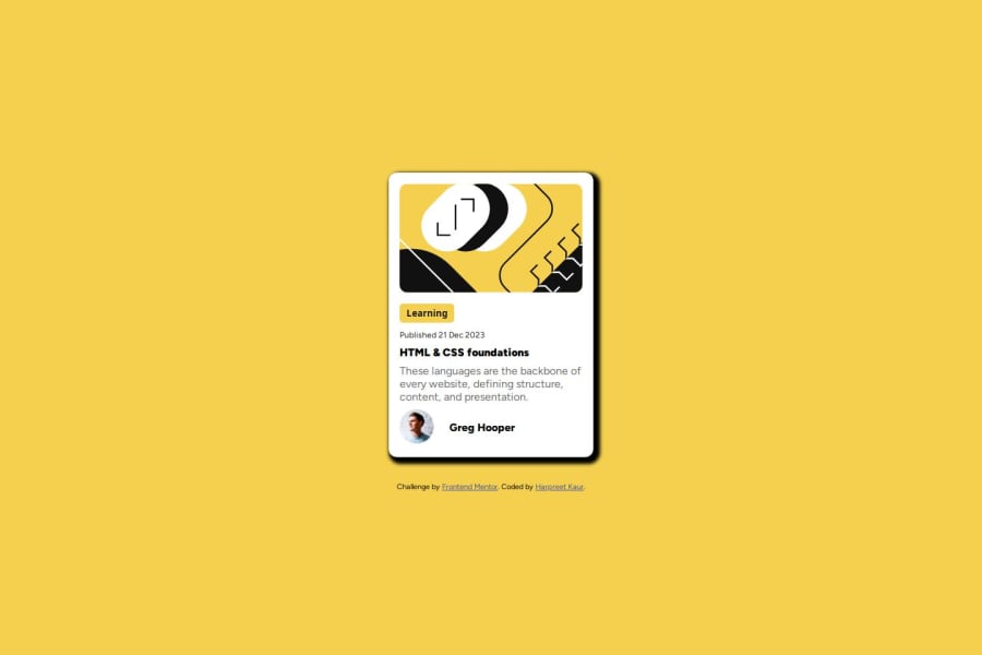


Design comparison
SolutionDesign

Solution retrospective
What specific areas of your project would you like help with?
I have fixed semantic and styling, Please advise any feedback to improve the styling in the future.
Community feedback
- @hitmorecodePosted 3 months ago
Congratulations well done, looks good. Just a few tips
- The card shadow has soft edges, you need to make hard.
- For a simple card like this, you don't have to use this many layers div's.
- You could have done something like this:
<body> <main> <img src="" alt=""> <button></button> <p></p> <h1></h1> <p></p> <footer> <img src="" alt=""> <p></p> </footer> </main> </body> or <body> <main> <section> <img src="" alt=""> </section> <section> <button></button> <p></p> <h1></h1> <p></p> </section> <footer> <img src="" alt=""> <p></p> </footer> </main> </body>- You don't have to add
width: 100%on the body, by default the width of the body is always 100%. - Set the height of the body to
min-height: 100vh;instead ofheight: 75vh;
I hope you find this helpful. Keep it up 👍👌
Marked as helpful0

Please log in to post a comment
Log in with GitHubJoin our Discord community
Join thousands of Frontend Mentor community members taking the challenges, sharing resources, helping each other, and chatting about all things front-end!
Join our Discord