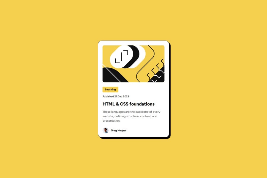
Design comparison
Solution retrospective
I've taken the time to adjust units and media queries trying to keep the code as clean and organised as I could. Next time I will organise my workflow better before I start coding
What challenges did you encounter, and how did you overcome them?Prevent the SVG image to overflow was challenging but made me grow. With each challenge I learn something new.
What specific areas of your project would you like help with?I'd like feedback on the CSS in general.
Community feedback
- P@KellenkjamesPosted 5 months ago
Overall, your CSS is well-structured and uses media queries effectively to adapt the layout to different screen sizes. However, there's an opportunity to improve responsiveness by using more flexible units for width and height definitions.
Specifically, using fixed pixel values (px) for elements like
h1and.cardcan limit their responsiveness across various screen sizes. This might require additional adjustments in media queries to maintain a good layout.Here are some suggestions for improvement:
1. Fixed Width and Height on h1 (lines 39-40):
h1 {
  display: inline-block;
  background-color: var(--yellow);
  width: 85px; /* Fixed width */
  height: 30px; /* Fixed height */
  border-radius: 4px;
  font-size: 0.875rem;
  text-align: center;
  padding: 0.286em 0.857em;
}
In this case, there is no need to set a fixed width or height on an
h1since the content itself determines the width and height. Consider using relative units likeremoremfor font sizes to scale proportionally to different viewports.2. Fixed Width and Height on .card (lines 76-84):
.card {
  width: 384px; /* Fixed width */
  height: 522px; /* Fixed height */
  background-color: var(--white);
  border: 1px solid var(--black);
  border-radius: 20px;
  box-shadow: 8px 8px var(--black);
  padding: 1.5em;
}
Setting a fixed height for the image can lead to distortion on different screen sizes. It's strongly recommended to avoid setting fixed heights for images. Instead, use
max-width: 100%andheight: autoto allow the image to scale responsively while maintaining its aspect ratio.By avoiding fixed width and height declarations and using more flexible layout techniques, you can create more responsive and adaptable designs that work seamlessly across a wide range of devices and screen sizes (with writing less code).
Here's a good article on why CSS units matter for responsive design: https://pieces.app/blog/css-units-responsive-website-designs
Hope this feedback helps and keep up the great work!
Marked as helpful0P@Kiara523Posted 5 months ago@Kellenkjames Hey thanks for the feedback...It helped me to review a few things that I needed to improved and I've already applied them to the social links profile challenge. I'm a beginner and it was very useful...
0
Please log in to post a comment
Log in with GitHubJoin our Discord community
Join thousands of Frontend Mentor community members taking the challenges, sharing resources, helping each other, and chatting about all things front-end!
Join our Discord
